Architect Roger Ferris Talks Minimalist Design
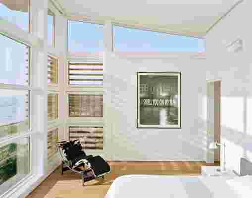
When you’re faced with spectacular views of New York’s Noyack Bay, a glass-walled house seems like the only way to go, but what about privacy? A piece of waterfront property on Long Island Sound is hard to beat, but it’s incredibly narrow; how do you fit the home of your dreams? Tough questions like these are something Connecticut-based architecture firm Roger Ferris + Partners excels at answering with grace. Aluminum louvered screens will keep the first place cool and away from prying eyes, while the second structure’s dramatically angled glass front allows for ample sunlight without taking up any extra space on the lot. “Roger Ferris produces strikingly inventive works of architecture in which the pursuit of maximum functionality is inseparable from a rigorous modern aesthetic,” writes architectural historian Robert Rubin in the foreword of the new book on the company, Inventive Minimalism: The Architecture of Roger Ferris + Partners (The Monacelli Press, $45). “Programmatic needs, fulfilled in the most elemental, unadorned manner, are transformed into tectonic drama, elegance, and power.” We spoke to the talent himself to hear what he has to say about minimalist design and his creative process.

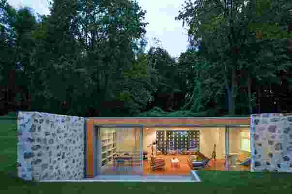
Country Estate in New Canaan, Connecticut, 2010.
Architectural Digest : What do you want readers to take away from your new book?
Roger Ferris: “A sense that architecture can be distilled into a more essential form without sacrificing its function; that buildings can have clear narrative properties; and that even though our work is decidedly contemporary in form and application, it is still deeply rooted in the context of both the client and the site.”

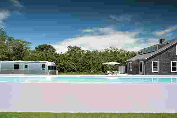
Surf Shack in Sagaponack, New York, 2012.
AD : How do you approach creating something both beautiful and functional?
RF: “Part of the underlying ethos of our firm’s work lies in a more generous interpretation of these often dichotomized ideals. As architects we strive to fulfill our mandate to create architecture that works, of course, but we also attempt to interpret the client’s program in new, unexpected ways that allow for a new reading of space and of relationships between functions. Formally, we work with light, volume, pattern, texture, and material in the same way—envisioning sometimes unconventional combinations. In this way, space and program both have a functional, dramatic power, which can be read as a harmony between beauty and function.”
AD : Where do you look for inspiration?
RF: “Contemporary art and sculpture (Xavier Veilhan, Damien Hirst, Nathan Coley, Gerold Miller, Benjamin Edwards, Jenny Holzer, Kees Goudzwaard, Nova), furniture (Dune, Edra), vintage cars, architecture (Le Corbusier’s Carpenter Center), just to name a few.”

Sound House in Fairfield, Connecticut, 2003.
AD : How do you ensure a minimalist home still feels warm and inviting?
RF: "We are very involved in the selection of artwork and furnishings in our projects—and respond to each client’s individual preferences in kind. We attempt to create forms and spaces that are comfortable but also yield something more—a feeling of something essential or original. This is what minimalism can afford, if done right. In a paradoxical way, this approach is additive in the sense that it can provide clarity and peacefulness even though it is about reducing clutter, noise, and chaos.”
Arc House in Westport, Connecticut, 2016.
AD : Do you have a favorite project in the book?
RF: “I don’t have favorite children or favorite projects.”