Five Reasons Why the Newly Renovated Boulevard Is San Francisco’s Most Stylish Restaurant
When San Francisco’s notoriously soupy weather made pandemic-era outdoor dining at Boulevard, the city’s most iconic waterfront restaurant, a damp and chilly prospect that even a stunning, close-range view of the Bay Bridge couldn’t overcome, chef-owner Nancy Oakes decided to batten up the hatches of her beloved bistro and embark on a major redesign instead.

AD100 designer Ken Fulk
“The restaurant was coming up on its 28th year and needed to be seen with younger eyes,” says Oakes, who tasked her friend and business partner, designer Ken Fulk of San Francisco–based Ken Fulk Inc. , with that fresh perspective. With such high-profile restaurant-design projects like Contessa (Boston), Noda (New York), and Swan (Miami) in his portfolio, Fulk and KFI senior designer Alice Crumeyrolle set about giving Boulevard “a new suit of clothes.”

Boulevard chef Nancy Oakes
Though there’s a breathtaking new bar to sidle up to and gilded mural work to ogle, the designer’s foremost responsibility was to the restaurant’s signature Art Nouveau underpinnings. After all, these Belle Époque–inspired details only embolden the restaurant’s alter ego as a hidden gem you might stumble into for a heartfelt meal—Oakes’s international cuisine, ever evolving but always made with the best of the local harvest, has earned multiple James Beard awards—on a cold night wandering around Montmartre.
“My first rule to myself is ‘Don’t screw up anyone’s romantic notions about a place,’” Fulk says. “I didn’t want anyone to walk in the door at Boulevard and feel like they were anywhere else but the best version of the place they’ve always loved.”
Five (Design-Related) Things to Discover When Dining at Boulevard
Peacock mural
The peacock has long been a touchstone of beauty and prosperity, a motif apropos of such an iconic San Francisco restaurant. But in Boulevard’s new chapter, chef-owner Nancy Oakes finds the strutting peafowl’s Greco-Roman symbology particularly meaningful. “The peacock, even more than the phoenix, symbolizes rebirth and rejuvenation,” she says. Luckily, the bird’s unmistakable grandeur is also an aesthetic fortune, inspiring the opulent tableau’s color palette of teal, rosy red, and gold. Fulk transformed Boulevard’s bar and lounge area with a gilded peacock mural by Bay Area artist Deborah Phillips, which conveys a light windswept-ness on account of its whiplash lines, a trademark of the Art Nouveau style. “Murals are great storytelling devices,” says Fulk, who has commissioned such grand site-specific works for past San Francisco projects like the Saint Joseph’s Arts Society and celebrity chef Tyler Florence’s upscale steakhouse, Miller & Lux . “In this case, we wanted to bring the motif more forward to really celebrate its meaning.” For her part, Oakes is utterly mesmerized by the piece. “I love the way it catches the light,” the chef says. “And how it looks like it’s always been there.”
Blue-onyx bar
Fulk fondly recalls the mid-1990s, when sitting at the bar at Boulevard was a way for the aspiring designer and new San Francisco transplant to tap into the energy of the city, which was in the throes of a restaurant Golden Age. “I was the kid who was living beyond my means and having a glass of wine with lunch that I couldn’t afford,” he says. Honoring this part of the restaurant with a new 38-foot blue-onyx bar was, as Oakes describes it, “quite an intake of air.” (Cue gasp.) Furthermore, the solid stone slabs, sourced from Brazil, are lit from within with LED lights, a sublime yet painstaking enhancement that not only highlights the sculpture’s cool, glacial color and delicate veining, but also adds magnetic appeal. “It’s literally a beacon,” Fulk says. Patrons naturally gravitate toward the glowing gemstone and even contemplate giving up their table reservations (guilty!) to roost on the Holly Hunt velvet damask bar stools instead.

The wine bar at Boulevard
Handmade wallpaper
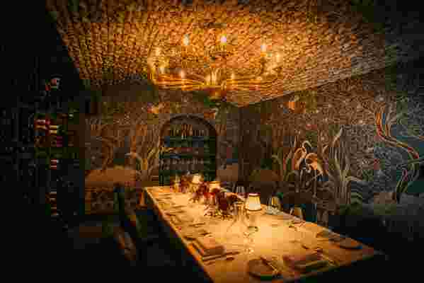
In the wine vault slash private dining room, Fulk installed a mural-like handmade wallpaper, designed by KFI art director Daniel Castro. As an even more ornate cousin to the peacock mural, the chinoiserie-style covering depicts a sumptuous woodland, where a pair of elegant herons take refuge under a draping tree canopy. (Lest you believe the fanciful setting to be inspired by any place else other than San Francisco, the portrayal of the Golden Gate Bridge should clear up any such misconceptions in a short span.) Fulk, who has collaborated on a collection of textiles and wall coverings called the Surreal World with French design company Pierre Frey, opted against a painted mural in this cozy space primarily for texture—the grass cloth simply emphasized is nest-like essence. The newfound femininity of the wine vault is heightened, so to speak, by the limewashed brick ceiling and the curvaceous vintage Venetian glass chandelier overhead. “Ken’s love of small places to hunker down is really expressed in that room,” Oakes says. “It’s a beautiful space that huddles people together, which is what they want to do anyway.”
A lamp detail at Boulevard
Verdigris metal
Boulevard’s signature Art Nouveau decor is revealed primarily through its organic shapes, sinuous lines, vegetal motifs, and mosaic columns that recall Tiffany lampshades of the era, but Fulk underscored the theme—subtly, but to great effect—by refinishing all of the original metalwork (from the lampposts plucked from the streets of Chicago to the riveted ceiling beams, a nod to the Bay Bridge, according to Oakes) in verdigris. “It created this beautiful, greenish patina that lightened the space,” Fulk says. In addition to drawing attention to the restaurant’s formerly unsung barrel-vaulted brick ceiling, the color is also reminiscent of the metal architecture of the iconic Art Nouveau Métro entrances in Paris, which jibes with Fulk’s more transatlantic interpretation of Boulevard’s aforementioned riveted beams. “They remind me of the Eiffel Tower,” he says.
Luxury textiles
Where once there was clubby, dark brown leather, there is now an unapologetic onslaught of lavish fabrics by Pierre Frey, Jim Thompson, and KFI that cover everything from the chair cushions to the banquettes to the walls. While the textiles function foremost as a hefty dose of personality-driven color in a space that tends toward masculine gravitas, upon closer inspection, they bear details like a KFI-designed royal blue peacock pattern on the dining room walls and thick-wale texture on the teal lounge seating. Even the barrel ceilings above the dining room have been upholstered in custom crimson fabric for sound absorption, and, as Fulk says, “one less hard surface, and one more burst of color.”
Outside of Boulevard, looking toward the San Francisco Bay Bridge and the Bay beyond.
“We really leaned into the use of color and patterns,” the designer continues. “I think the fabric was the one thing that unified the metals, mosaics, brick, and murals.” Oakes concurs. “Left to my own devices, I’m not sure I would have been able to pull it off,” the chef says. “But I guess that’s why I keep Ken around.”