Frame of Reference
View Slideshow
When last we met the principals of Shelton, Mindel Associates in these pages, they were wrestling with a rapid-fire, eight-week Southampton beach house redo, which they made look like a work for the ages (see Architectural Digest , November 2005). This month we find the Manhattan-based duo tackling another interior design classic: a turnkey developer apartment, their clients' blind love for it and the heartbreak the architects know is just around the corner.
The setting is a penthouse atop a newly completed residential tower in Tribeca—high ceilings, glass walls, wraparound terrace with uncommonly fascinating views of lower Manhattan and beyond. The clients, a couple with an interest in the arts and a significant collection thereof, had visited the concrete shell of the place and had been smitten by the air and the light. Their designers could see disappointment gathering with the weather over the distant New Jersey hills.
What had been a tweak-here, tweak-there project became an overhaul—handled nonetheless with a light, tactical touch.
"The decisions made by a developer aren't necessarily ones you'd make yourself," Lee F. Mindel says, sitting in the living room of the completed apartment. "I knew every grille, every door, every switch, would have to be replaced. I knew," he adds, "that we were headed for some tough times."
The tough times did materialize, briefly, when construction was finished and the clients saw what Mindel had foreseen: that the developer's taste—in moldings, in hinges, in finishes—was not quite their own. So what had been conceived as a tweak-here, tweak-there project became a more involved overhaul—handled nonetheless with a light, tactical touch.
"It's probably easier to start from scratch on anything than to come in and make it right," Mindel says. "Still, we wanted to maintain the context without unraveling the whole thing." In keeping with that strategy, the floor plan remained largely intact, but the nature of the spaces was transformed. The principal spatial tool employed by Shelton, Mindel in that effort is a series of gridded planes, grafted onto the bones of the apartment to shape each space. "Using a metaphor for a client who loves drawings, the reveals in the planes become like linework in the space," Peter L. Shelton says.
One finds the first of these drawings-in-space immediately after stepping out of the elevator and into the 12th-floor apartment. An L-shaped insert defines a long gallery, providing a background for a lovely mis-en-scène: a series of five etched German sheet-metal gratings by Rachel Whiteread, set above a white shelf with brilliant Pol Chambost ceramics in saturated primaries. The panel continues on the ceiling, where it conceals the lighting that makes the whole still life pop. Underfoot, a custom rug is very subtly patterned to evoke a shadow thrown by the gridded panel; the angled lines of this nearly subliminal device also serve to direct guests to the right, toward the apartment's living spaces, and away from the trio of bedrooms—a master suite and bedrooms for the couple's two teenage daughters—that open off a second, smaller gallery to the left.
The idea behind that clever textile, playing with light and serving to orient travel through the apartment, is carried further in a pair of giant rugs that ground the remainder of the public spaces. You see it first in the living room: a thin line of an indeterminate yellow—Mindel calls it "the color of sunlight"—that arcs through the otherwise off-white grain of the wool-silk blend. It arcs past the black baby grand, under the sofa, around the Perriandesque low table, jumps to a second rug beneath the dining table and finally wraps up in the concealed sitting area, dominated by an Andreas Gursky photograph, around the corner.
That placement was no accident. "I wanted this room to feel like you were occupying the space of a Gursky photograph, and then you turn the corner and see one. It's foreshadowing!" Mindel says.
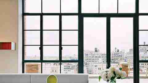
The challenge in this suite of spaces, with more than 50 feet of uninterrupted glass walls on two exposures, was to complement, not do combat with, the very busy, very rectilinear views. The unifying "sun line" of the rug was one means, the photo another. The continued use, as in the entrance hall, of framing inserts (here serving as a fire surround) is a third. A fourth, more subtle, method is found in the arrangement of the art itself—a Donald Judd underscores the gridded view; organic works in glass, on the low table, pick up the curves of distant water tanks—and in the treatment of horizontal surfaces, which Mindel says "dematerialize" in the ample light.
Significantly, this effect was achieved in part by reducing somewhat the impact of the windows in the room. The space was delivered with flat ceilings and straight walls. Seeing that in some ways it was too clean to evoke the downtown loft it was trying to mimic, Shelton, Mindel added a bay system to the window walls and several beams in the ceiling. The effect of this clever artifice was to define the spaces, where they once flowed into each other willy-nilly, and to better frame the views. A detail at the ceiling, where the top member of the building's rather heavy (and preservation-office-mandated) fenestration is deleted by the addition of a pocket for blinds, helps to lighten the whole feel, leaving the frame of the windows open, in effect, and letting the views come in.
Which, of course, was the final blow in erasing the memory of the off-the-shelf developer fittings and fixtures that had started the whole ball rolling. "They're modern, in-touch people who are very engaged," Shelton says. "We wanted it to be alive and not frozen in formaldehyde."