How Smart Design Is Strengthening Our Elections
Ever since the 2000 presidential election and its hanging chads, Americans have looked closer, trusted less, and worried more when it comes to voting. Since then, chaotic messaging around elections has only gotten worse. This year, germs and mail fraud are in the spotlight, but are these really the things keeping us from turning out? Probably not. Most people do care and want to vote . Yet the United States has some of the lowest voter turnout globally among established democracies. Certainly giant obstacles like gerrymandering and campaign media and finances need to be addressed. But more quotidian influences also affect whether or not we show up.
“We don’t think of voting as hard, but there are microbarriers that can really trip you up,” says Whitney Quesenbery, cofounder and executive director of the Center for Civic Design . “There’s a gap between our desire to vote and our ability to vote.” Quesenbery’s job is to remove those barriers.
And good design can help. From the readability of civic collateral to the accessibility of polling centers, design has an important role to play in democracy. It can deter participation or inspire confidence in electoral integrity. And this year, instilling a sense of trust is more important than ever. Nearly half of all registered voters expect “to have difficulties casting a ballot,” according to the Pew Research Center . That’s a big pivot from just two years ago, when 85% assumed voting would be a breeze.
Designing to support democracy starts well before the ballot box. Information about elections, candidates, issues, and voting options should be accessible and easily understandable, not intimidating or overwhelming. A human-centered approach serves to inspire confidence in the process and procedures. “All materials should be an invitation to vote,” says Quesenbery. For ballots, best practices include using big enough text, smart formatting, lowercase letters, and sans serif fonts. Instructions and questions should be written in clear, plain language and prioritize what’s most important. The best ballots aren’t just visually pleasing, they’re readable and “make you less anxious,” says Quesenbery, because they deliver what she describes as “a gentle experience.”
Take the envelope for the North Carolina mail-in ballot that her organization recently redesigned. The existing material was a chaotic mash-up of confusing text and angry red boxes that drew attention to negative words like fraudulent. “When I looked at it, the first thing I felt was, ‘What did I do wrong?’” says Christopher Patten, civic design researcher at the Center for Civic Design. “The text kind of said, ‘You’re in trouble!’”

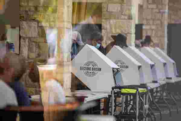
People cast their ballots at a semi-outdoor polling location on October 13, 2020, in Austin.
To remedy that, due dates and legal reminders were rewritten in plain language, and instructions and other critical information were formatted as numbered steps and bulleted lists. The state seal was also added, delivering a symbol of trust. The end result is a friendlier piece of media that looks like a person created it, not a “mean machine,” explains the designer. Patten emphasizes that these decisions are about humanizing election literature and procedures, “not just making it look pretty.” In other places, technology is modernizing the process. New voting machinery in Los Angeles County, developed in collaboration with design firm IDEO, uses touchscreen technology that offers ballots in 13 languages, ensures better visibility, and enhances accessibility for those with hearing or low literacy concerns, making the voter experience far more equitable for the region’s five million voters. And though there were hiccups during the initial March rollout, most voters found the updated equipment to be an improvement . Where and how we cast our ballots is, of course, critical too. COVID-19 adds a layer of urgency to the safety and health of in-person voting this year. Ventilation, hand washing, and mask wearing remain as important as they are in any public space. The ballot drop boxes that many municipalities have installed help address health concerns while still allowing those who enjoy the ceremony of voting publicly to enjoy that ritual. But the need for social distancing for in-person voting adds complications, especially for polling places where long wait times are already a concern. As a response to these apprehensions, the National Association of City Transportation Officials has translated its thinking about pandemic responses into series of best practices for how public spaces can be best used for voting. Flexible outdoor areas such as streets, sidewalks, bike lanes, parking lots, and so on can help enable safe distancing. Transparency and signage to inform voters about queues, wait times, and sanitation protocols, along with considerations for weather, can all help improve the voter experience. “The pandemic has already forced cities to think differently about their resources,” says Corinne Kisner, executive director of NACTO, “and safe voting opportunities are a natural extension of this thinking.”
For many of us, voting is taking on increased importance and urgency during this unprecedented time. As Quesenbery puts it, “Voting is the social glue of democracy.” In many ways, design influences our experience and perception of voting, which highlights its subtle yet crucial role in this fundamental American right.