Inside a New York City Apartment’s Subtle Transformation
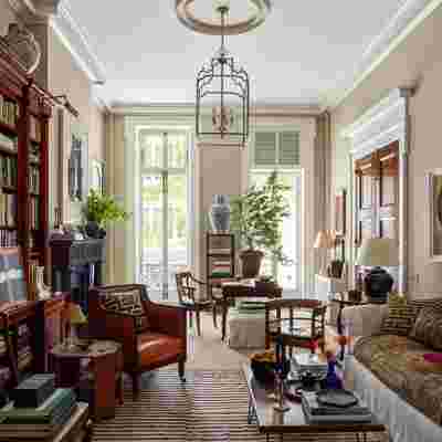
Of the many lessons Gil Schafer has learned over his illustrious career, one is perhaps most practical: “It’s always better to experiment on myself rather than on my clients,” says the celebrated New York–based architect, who has put his affinity for classical vernacular at the forefront of his creative process. Nowhere does that sentiment ring more true than in his own pied-à-terre in Manhattan’s West Village, a carefully reconstructed Greek Revival treasure trove with recessed crown moldings, faux-grained mahogany doors, and two stately Ionic columns delineating the living area.
So when Schafer decided to reimagine the parlor-floor space through a slightly more contemporary lens with help from his firm’s interiors department, it wasn’t without some hesitation. “I’m a hopeless traditionalist,” he says. “I love layers and things that tell a story. Anyone who’s in this business falls in love with objects to their own peril. But as I’ve gotten older I’ve loosened up about mixing pieces from different time periods and paying more attention to what has a nice line or variation in wood color. It’s nice to have this space as a canvas to sketch on as my design thinking evolves.”

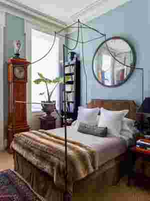
Gil Schafer designed the custom canopy bed in the main suite in the style of a 19th-century campaign bed and had the headboard and bed skirt covered in suede by Dualoy ; the faux fur throw is from KRB , and the wool throw is from Aero . He also custom designed the ebonized bookcase in the corner. The antique mirror was purchased at Nadin & Macintosh , the Swedish case clock is from Evergreen Antiques , and the cast-iron urn was bought on a trip to London and placed atop a Regency mahogany pedestal from Cove Landing.
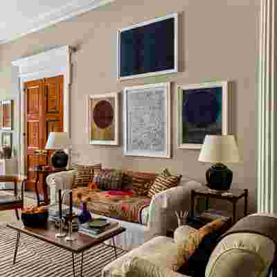
The latest iteration of the 900-square-foot apartment retains its classical underpinnings yet serves as an experiment in judicious updating. “I wanted to see what would happen if I maintained the envelope of the space but made just a few impactful changes,” says Schafer of his understated approach to editing. First, he removed heavy curtains and wall upholstery in the bedroom to give the space an airier feel, then painted the partitions in soothing shades of blue and beige. Knowing that he would retain many of the furnishings—which were collected over time both on professional scouting trips and personal vacations with his wife—he slipcovered chairs in neutral linens and enlivened the sofa with vibrant textiles and throw pillows; a graphic black-and-white rug in the living room lends a sense of modernity and movement to the gently rearranged period-era antiques. “I wanted it to feel different without completely recasting the space,” says Schafer.
But aside from paring down the physical objects in the various rooms, the biggest change comes courtesy of the artwork. “There’s more square footage on the walls than on the floors,” says Schafer of the surfaces that arise as a result of the narrow residence’s soaring 13-foot ceilings. “The volume of the space is so unique that it forces you to think differently about how you decorate.” He opted for large-scale contemporary works by the likes of Corey Daniels that bring his beloved antiques and early 1900s–era New York engravings into the 21st century.


The combined effect is a subtle shift that nevertheless transforms the home into a tranquil oasis in the heart of the city. “If I were a more rigorous modernist, I would have been even more clean and minimalist,” says Schafer. “At first, I was worried that I had not changed enough. But you have to be true to who you are. This feels like a natural progression.”