Inside a Worldly Florida Home Where Imperfect Design Is the Name of the Game
The Treasure Coast, named for 16th-century shipwreck cargo discovered in 1961, lies on the eastern shores of sunny Florida . Its combination of sandy beaches, lush pine and palmetto flatlands, and shallow bodies of water have long made it an enviable retreat. It’s also, designer Lori Deeds discovered, a great location for a full gut reno.
“We realized that the house has this wonderful character about it,” the Kemble Interiors decorator says of the cracker-style abode that she and her colleagues were tasked with updating. “The rooms are small enough, but not too small. The ceilings were high enough, but not too high. We raised some of the doorways up because we had such tall ceilings,” she explains.
Beyond those good bones, Deeds’ clients were inspired by a trip to Marrakech that helped inform the stylistic mood of the house. “Most importantly,” she avers, “they wanted it to be eclectic, quirky, casual. They wanted found items. They wanted it to look a bit unmatched, and they wanted it to lack harmony.”

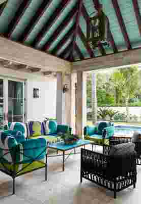
The pavilion, which overlooks the pool, is a tropical paradise. All of the velvet fabrics are appliquéd. The custom table features Moroccan tiles.
Ironically, the mélange of colors and textures from Morocco, as well as the Dominican Republic, India, and the African continent, resulted in a marvelous orchestration of design that is unexpected yet harmonious. “Every time I tried to coordinate fabrics, they said, ‘No’,” Deeds recalls. “I think the best answer in the world sometimes is ‘no.’ They did such a good job of keeping me outside the box and pushing me, pushing my designs, and pushing my artistic creativity. They wanted this imperfect quality throughout the house.”
It was the owners’ precise attention to details and distinction that created a magical and somewhat mystical mediation on modern, global living. Deeds explains that the space conveys “that you have now stepped into a different world. You have entered something fantastical, [and] you don’t quite know where you are. . . ”


Buy now for unlimited access and all of the benefits that only members get to experience.
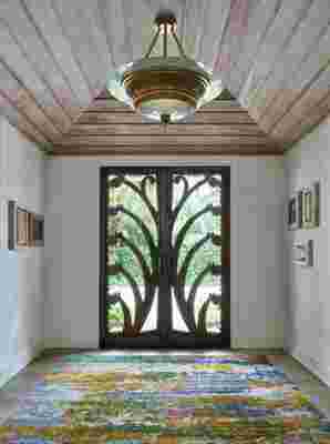
From the front doors, which are solid aluminum and weigh 400 pounds each, to the entryway with its soaring cypress ceilings and hand-hammered silver tile flooring, that much is certainly clear. The entryway leads into a 500-square-foot great room—a combination of dining and sitting areas—with a large bay window and French doors. Four copper chandeliers and a palm ceiling fan are just a handful of the objects that set the stage on which disparate styles can interact.
All that said, Deeds also felt strongly that the house came across as warm and inviting. Another requirement was that—despite the evident cacophony of color—it needed somewhat neutral walls, in order to display the owners’ art collection. “Everything had to tell a story,” Deeds adds.
To that end, discordant moments in the design became the blueprint for the rest of the house. “I think that opposites attract,” Deeds muses. “[And] I love mixing styles. Why can’t midcentury be eclectic?” As for that specific topic, one prime example might be a pair of modern chairs, which are placed next to a more traditional sofa. “What it does is allow each piece to sing and to have this presence, because you see those chairs, but you also see the sofa. And if the chairs had been the same style as the sofa, you probably wouldn’t see [them]. So, I think the contrast allows things to stand out and sing on their own, and hold their own space.”