Inside This Upper East Side Pied-à-Terre, Every Detail Matters
This one-bedroom pied-à-terre on Manhattan’s Upper East Side was hardly Gregory Rockwell ’s first rodeo. But it sort of felt like it. “It was the first project where I had freedom to do exactly what I wanted to do on my own,” says the interior designer, who established his namesake firm in 2017 and now splits his time between New York, Los Angeles, and Maine.
The clients were a recently retired couple based in the Hamptons who had finally bought their dream second home: an escape in Manhattan for just the two of them. “It’s a place for them to have beautiful cocktail parties and candlelit evenings, to explore this city they’ve always lived so close to,” explains Rockwell, who brought on interior designer Hester Hodde for the job. Rockwell and Hodde studied the clients’ primary residence in East Hampton to get a sense of their taste and found that the couple had an eclectic side and a love of color.
“We wanted to give them what they didn’t know they needed,” says Rockwell, “which is what we want to do with every client. We want to elevate what they love.”
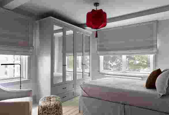
One of their first purchases was a photograph (Rockwell and Hodde did all of the art consultancy for the project). When they scored a dreamy piece by Justine Kurland at Mitchell-Innes & Nash , it quickly set the scene for the bedroom, which Rockwell describes as “absolute serenity.” The hazy blue sky in the photograph was color-matched by Benjamin Moore and translated into paint for the walls; a bright red ball in the picture inspired a custom red lantern.

“We work with a fabulous mother-daughter duo called Shades From The Midnight Sun,” Rockwell explains. “They make these amazing, delicate lampshades, lanterns, whatever you can dream up at their home in Bronxville.” Rockwell collaborated with them to add a pop of crimson to an otherwise monochromatic bedroom. Sections of the light were hand-embroidered in India, and Hodde designed a tassel that was produced in Paris by Prelle . “Everything has that detail,” says Rockwell.
The combined living and dining area was conceptualized around efficient use of the space—the client wanted a central sofa, for instance—but the art remained key to bringing the room together. From a colorful painting by Derek Fordjour they pulled accents: moss-hued Dedar velvet pillows with hot pink Samuel & Sons piping, an amber mohair on the armchair, and a peach sorbet–hued wool-linen chenille on a pair of ottomans. Says Rockwell, “There’s always this balance of playfulness and sophistication.”
It was in that very living room that Rockwell and Hodde had what he likes to call the “just trust us” moment. This one involved the plaid cashmere Roman shades. The designers got the idea when they were visiting Walter Gropius’s Bauhaus-style home near Boston and noticed his blue plaid curtains. “It didn’t seem like it would work, but it worked in my mind,” Rockwell explains of his own rendition, in Holland & Sherry ’s Baudelaire plaid. They spent nearly six weeks discussing shades before placing the order, and the client still didn’t really get it. That is, until they saw the shades in situ. “As soon as they walked in on reveal day, they were like, ‘You were right this whole time!’” says Rockwell, beaming with pride. A similar situation unfolded around an equally daring Misha Kahn desk lamp and the neon silk moiré upholstery used on a set of 1950s Italian dining chairs.


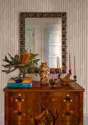
For Rockwell, the key to all these small wins was taking the time. And he brought that same attention to detail to nearly every element of the house. The entryway sports fluted Venetian plaster walls by Kamp Studios , who also revamped the mantel (“the original was a little Home Depot in the ’80s”) by hand-applying bronze with a trowel. Rockwell and Hodde gussied up a simple galley kitchen with a mosaic tile floor, fabricated by hand in Morocco. They even convinced New York–based plaster artist Stephen Antonson to venture outside of his usual chalky white palette and create a gunmetal-hued mirror that hangs over the fireplace.
“When we met these clients, they had a vision of a clean, hotel-looking space,” Rockwell explains. “And that’s most clients’ idea of a Manhattan apartment: a suite at the Peninsula Hotel. But once we started working together, once they saw the exuberance that we put into every choice, they fell in love with the process. They started to really love seeing the wild card in the deck come through.”
“The apartment is not that big, but I wanted the mantel to be kind of ridiculous—to really play with scale and proportion,” Rockwell explains. “And what’s more ridiculous than a bronze mantel?” The plaster masters at Kamp Studios hand-applied liquid bronze (almost like plaster) to an MDF frame, creating what you see here, which will patina over time. “To me, this mantel is a showstopper.” Above it are Lindsey Adelman sconces, 1780s candlesticks from Dienst & Dotter, vases by Danny Bowen, a ziggurat sculpture by Elliott Levine , and a mirror by Stephen Antonson. The andirons are from Wyeth .