Oyster Bay Evolution
View Slideshow

The house was a Georgian Revival that had been radically transformed just a few years before. "We lightened it and gave it new life," recalls interior designer Sandra Nunnerley, who worked with architect David Estreich on this project in Oyster Bay, on Long Island's North Shore (see Architectural Digest , February 2001).
In the last few years, though, the clients' needs had changed. They wanted a "more permanent space in which to entertain," says Nunnerley. A room of one's own was also a guiding concept—the husband wanted a study; the wife, a retreat. And, while they needed more square footage, they didn't want it to show, an idea that sat well with Estreich. "We've been doing a number of large houses, but doing them in a way where they don't seem so large," he explains. "It keeps the scale more appropriate to the neighborhood and the landscape."
Working with Brian Blackburn from his office, he decided to demolish the ranch house—transformed into a Federal-style carriage house in the first renovation—and replace it with a new wing set perpendicularly to the original brick structure. Razing the revised ranch building "gave us the opportunity to add to and connect the house," Estreich says. The striking brick wing that replaced it connects to the Georgian Revival building via a new clapboard addition and a fanciful belvedere.
You could say that the design for the new wing was picked up, quite literally, in the neighborhood. "We thought, We're sitting in horse country—why not have it be a barn with stables?" Nunnerley recalls. The elongated structure has "a Palladian tripartite concept," according to Estreich. "We based it on a Palladian stable house with arched windows. It almost looks like a renovated stable."
For the interiors, Nunnerley steered a middle course, as she had the first time around, between two people with drastically different aesthetic views. "She's very romantic and full of great fantasy," she says of the wife, who favors French and English antiques; her husband, a businessman, prefers a minimalist look. "We have somewhat different tastes," the husband allows, "and Sandra has always been very good at blending them." Doing so came naturally to Nunnerley. "My normal look is tailored, pared down," she says. "It has strong architecture, but it still has that romantic feel to it. It's a very clean, modern look."
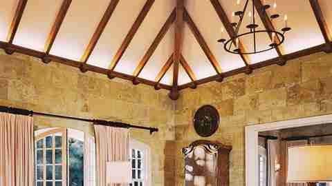
And that's what prevails in the high-ceilinged "barn room," which is both a family and an entertainment area. The wife had hoped for a "castle feeling," Nunnerley says; this room indeed gives a taste of palace life—the sumptuous idea of it, that is, not its cold, drafty reality. Its limestone walls set the tone. "They're a very warm, beigey kind of color," the designer remarks. "Limestone is not a cold element. It's textural, and that texture gives the room warmth."
The room's clean-lined look casts some of its more intriguing contents—including an audaciously shaped wing chair and a pair of baroque carved candlesticks from the 1920s that Nunnerley converted into lamps—into high relief. A cozy reclining area in a corner near the fireplace (the wife's idea, Nunnerley says) exudes a sense of elegant whimsy, one that recurs throughout this understated yet consistently surprising residence.
Nowhere is this truer than in the sensuously appointed, skylighted tower room, charmingly called "the stargazing room" by Nunnerley, which she furnished sparely with a few distinctive pieces, including a daybed of her own design. This room has been the wife's fantasy "forever," the designer says. "She loves to go up that spiral staircase and look at the stars at night."
The husband's suite of rooms, she adds, takes "a very Zen approach." With its pale Agnes Martin paintings and such intriguing furnishings as an Edward Wormley Sheaf of Wheat table from the 1950s, the oak-paneled study is uncommonly serene. The combined sitting and exercise room just off of it also functions as a gallery. "There was no room for any large art elsewhere in the house," the husband explains. "We built up this room to get the pieces out."
How many people have such pleasing visual stimuli as they crunch or power lift? On one wall, there's an outsize study of Yosemite by the German photographer Thomas Struth. Across the way, a multipaned window looks toward a lush ornamental garden that Bruce Berger, of the Dallas firm Armstrong Berger, designed, he says, to "look like it had always been there."
So, for that matter, does the entire new wing. "Everything is conceptualized as one," Nunnerley says. "Everything is seamless. It was the architecture, the interior design and the landscape coming together as one."