Palm Beach Punch
View Slideshow

If you want to take the real measure of a designer's capacity for invention, don't give him a historic gem, a standout piece of architecture or an open playing field to work with; give him, instead, the limitations of an undistinguished box.
This is precisely what Thomas Britt's clients, an investor and his wife, handed Britt in Palm Beach, Florida. The apartment, while in a prominent building, did not have a single redeeming architectural feature. The ocean views were splendid, naturally, but since the windows were set in place, so was the floor plan. Britt was free to strip away old details and replace them with new ones, but the apartment had to remain configured as it was. And it had to convey a crisp message: "We wanted a vacation home that was sophisticated but clear and comfortable," explains the wife. "We didn't want it to fall into the usual Palm Beach groove. We didn't want formal, and we didn't want Lilly Pulitzer. We wanted it to look like—us."
Britt began—where else?—with the bones. For interior architecture he turned to his colleague Peter Napolitano, and, with project manager Elias Gutierrez, they decided to take the space back to its beginnings, then build it up again. The most transforming gesture was raising the ceiling—six inches, max, but when it comes to height, every crumb counts. The men relocated doorways and raised them as well. They gutted and redesigned the baths and kitchen. In the library, they installed shelves and a dado; throughout they added new, chunky moldings and valances, all washed by subtle recessed lighting. The finished layout was unchanged from the original yet a different species altogether.
After the bones, the flesh. Britt's clients came to the project with a love of contemporary art and a predilection for the color blue. They wanted to combine antiques and contemporary (or at least 1940s French) furniture. "I can do something with all that," Britt told them.
"The problem with blue is that it can be wishy-washy," remarks the designer, who seldom holds back his opinions. "I thought, Let's shake up everyone's expectations. Let's put the color on the floor and the ceilings, and leave the art to do the major talking in between."
"After all this color," Tom Britt says, "you do an about-face when it comes to the furniture."
In the combined living and dining room, the central public space of the apartment, Britt colored the floor in two ways. First he came up with a stain that he calls "a wonderful nothing putty that took some work to get right." On top of this he added an antique dhurrie that had been cut down from a formidable palace rug; boldly striped in two shades of blue, with a vein of orange snaking along in between, the rug gave the room an instant charge of pattern and color. Britt continued the motif of the stripes in his draperies, where white, mocha and blue silk panels alternate as they make their way across the windows. He put more blue, unexpectedly, on the ceiling and found a soft coral for the walls. Instantly the room began to hum.
"After all this color," Britt points out, "you do an about-face when it comes to the furniture." For Britt this about-face translated into white upholstery fabrics, white floor lamps, fanciful copies of white Frances Elkins side chairs pulled up to the dining table and a suite of gray-white Neoclassical armchairs that fill out the principal seating areas. The television was sequestered inside a handsome, delicately painted Italian armoire. Then against all this controlled simplicity came the vigor of the pictures: a Milton Avery in the dining area, an animated abstraction by Cecily Brown over the sofa, a punchy Léger over the card table beside the armoire.
"The main thing is not to overburden a space like this with too many ideas," explains Britt, "but to come up with a format and repeat it with a certain variety, so that it's not sterile." With this as his working principle, Britt found another blue-and-terra-cotta dhurrie for the library and a deeper blue for the ceiling and walls below the dado (with yellow above) and shifted from white to beige for the upholstery. In the master bedroom, the theme and variation continues: a different dhurrie still, celestial blue walls, more white upholstery.
It all sounds very straightforward—until you notice Britt's clever detailing. In the master bedroom, for example, the sea of blue is interrupted by deliberate white stripes—the molding picked out in a motif he first used in the public spaces. In the sons' room, Britt interrupted glossy white walls with cream stripes, an effect that somehow stands up to, without forcing anything on, the large Vik Muniz photograph of the head of a soldier made up out of small toy soldiers.
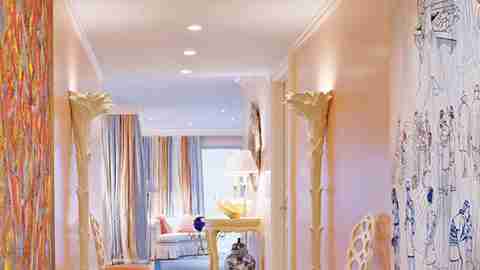
Then there are the designer's nods to Palm Beach. "Florida is about sunlight," says Britt, "so I tried to draw it into places it couldn't reach"—hence mirrors flanking the bed in the master bedroom and standing between the beds in the boys' room, which serve as alternative windows. Britt made other, more whimsical allusions to the apartment's setting by using white palm torchères in the hallway, where he displayed a giant clamshell on a white demilune table. And he played further with the Florida light by using a mirrored low table in the master bedroom and by setting an enormous 1950s Italian blue glass ball on a glass-and-iron table in the center of the living room. "Really, the whole interior pivots around that blue glass ball," says Britt. "It's like a magical object cast up by the sea."
Given his clients' original wishes, what could be more appropriate than a space that starts with a mysterious cobalt orb and radiates outward from there? "There's a part of Tom that's an illusionist," says the wife. "He can take the ordinary and make it anything but."