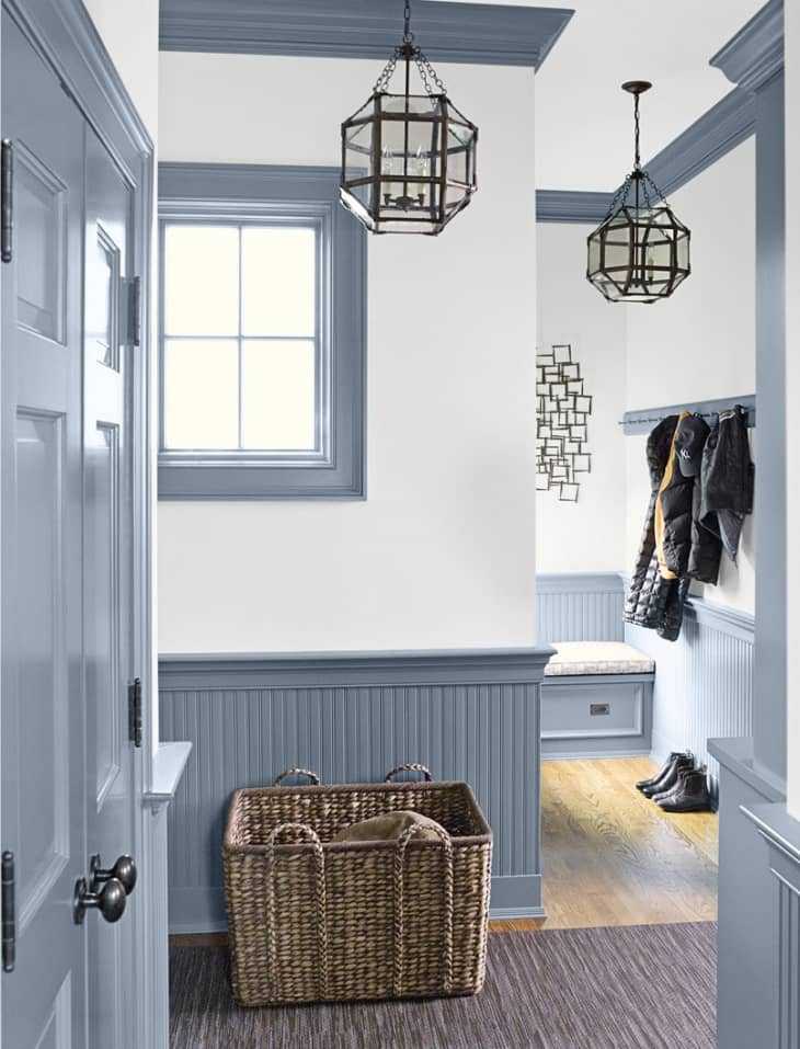
Rooms That Prove Molding Can Change Everything
You’ve probably seen big, dramatic moldings adorning the walls of beautiful, high-ceilinged spaces in dreamy Paris apartments. Maybe you found yourself thinking: “That looks great, but it would never work in my humble, totally average-sized American home.” I am here to tell you that you are wrong. A little architectural detail can liven up any space, no matter how small—and I’ve got the photos to prove it.
Above: In this photo from Style at Home , squares of molding attached to the wall imitate the look of panels, and give this nursery a dose of dignity and style that belies its small size. The treatment here is one that works in rooms of all sizes—apply a baseboard and a crown molding, and then allow the chair rail to determine the placement of the panels.

In this photo from Janelle Rigby , a painted wainscot and crown molding add the perfect touch to a small hallway/entryway. (While digging around to see what the appropriate height is for a chair rail/the top of a wainscot, I found a helpful article from This is Carpentry , which suggests that you allow the proportions of the space to determine the height of the chair rail—and that placing one too low is much better than placing it too high, which can make a small space look short and squatty.)
Moldings add a little dimension to this dining room spotted on Houzz . Note that, in a departure from the norm, the profile that serves as the chair rail is the same thickness as all the other moldings.
Except for questions of lighting, we tend to not pay a great deal of attention to the ceiling, but a beautiful ceiling treatment can really make a room, as this example from Christine Dovey proves. This is a great option for a room with a lot of windows or doors, where applying wall moldings might prove complicated.
One small space that often gets overlooked is the hallway. This hallway from Domino is admittedly a bit wider than most, but this look—a chair rail defining a wainscot, with wallpaper above—is easy to steal for your own space.
This living room from Domino has panels made from the very thinnest of moldings, emphasized by a very slight change in wall color. Using thin profiles like these is a great way to add architectural interest to a space without overwhelming it.
On the opposite end of the spectrum, there’s this room from Kim Jeffery , where using thicker profiles (I believe these are crown moldings) to create the “panels” makes them a particularly prominent feature of the space. I love this as a way to add character to a smaller room, just be sure to keep the other elements understated or uncluttered so the walls aren’t overwhelming.
Although the application is a bit trickier than in your average room, a stairwell can be a great spot to add a little architectural character. In this space (from House & Hold via Apartment Therapy ) paneled walls add interest while keeping the look calming and minimal.
Even in a tiny area like a powder room, a wainscot can make a big difference. Just remember that in a smaller space, it’s especially important to coordinate the wainscot with the other elements in the room. In this bathroom from Architectural Digest , the top of the wainscot is at the same height as the windowsill, for a harmonious look.