Samsung Smart Hub 2013 detailed - new menu system for Smart TVs
Samsung latest flagship TV model, the Samsung F8000 LED TV , was the biggest announcement at the company’s press conference, but it was the onscreen interface – rather than its appearance, or image quality – that got most of the attention.

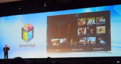
The new Smart Hub is the first thing you see when you power on the TV. It’s a simple statement but it’s also a huge statement of intent from Samsung – gone are the days of turning on your TV to find live BBC One chortling away. In the new world of TVs they are media hubs, ready to provide a variety of content and so the menu is the logical place to start. Although we wonder if there’s a setting somewhere to turn this off.
The new Smart Hub menu is divided into a series of pages, much like the homepages on an Android smartphone – though here each page has a specific function, rather than being blank canvasses for you to populate.
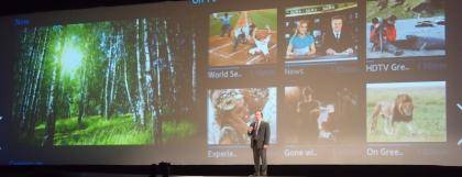
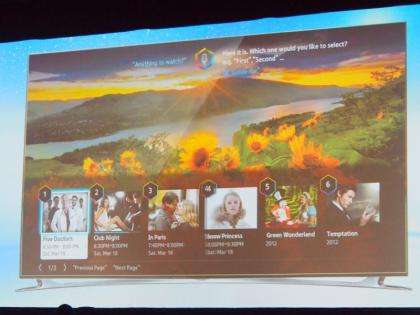
The first page uses the TVs new Tivo -style suggestions system to offer you programmes it thinks you might want to watch. At the top of the screen are programmes that are currently running, and below this is a list of upcoming choices – and how long before they each start. It bases its recommendations around all your viewing, but takes into account the time of day, so it will probably suggest cartoons for the kids on a Saturday morning, but adult dramas on a Tuesday evening.

The second page provides a single place for searching all the content available through your TV. This can be done using text entry or through the enhanced voice search capabilities of the new F8000 series TV.

Page three collates together all your media files from external sources, be that a USB flash drive or a network attached storage device. Here you can view photos, browse music and select videos to watch. Samsung claims that updated motion controls make it easier to browse content and find the bit you want, or to zoom in on photos, but we’ll give this a proper test on the stand over the next couple of days at CES.
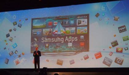
Page Four collates all your social media options, with the big services such as Facebook and Twitter supported among others. This is connected then to page five, which is where other apps are accessed or downloaded.

The new interface is available to owners of some of last year’s smart TV models, for more details read our piece on the Samsung Evolution Kit .
It all looks pretty impressive, and the clear delineation of functions to specific screens looks to remove much of the confusion from these ever more complex TV interfaces. We’ll be taking a much closer in the next couple of days.