Step Inside a Glowing Family Home in San Francisco’s Presidio District
Nestled in the treetops of Presidio Terrace—a lush enclave on San Francisco’s western edge—sits a three-story, midcentury-modern house that is decidedly different from its neighboring Beaux Arts, Mission Rival, and Renaissance Villa-style homes.
The house, with its sky-high perch, offers glorious views of the Golden Gate National Recreation Area. “It’s like a Miami design,” says Chloe Redmond Warner , founder and principal of Redmond Aldrich Design . “It doesn’t feel super San Francisco. It’s three levels with skylights built into floors; it’s such a random, sexy, architectural move.”
Although the client, a recently separated father of four, loved the house, its views, and location, the challenge was taking this modernist gem and making it feel cozy. What was most important to the owner and music enthusiast was providing a warm environment in which his children could feel at home. “The first step was to make it somewhere they could go that didn’t feel like a bachelor pad. The second imperative was to actually make it somewhere lovely,” Redmond Warner says.
Ultimately, lots of color and texture were added to the interiors, in order to offset the clean linear lines and existing walnut wood paneling. “We wanted to allow the midcentury-modern architecture to be the best version of itself—lots of white walls and big views—but to introduce it to a friend: A saturated, pattern-happy, colorful friend,” Redmond Warner says. “Wes Anderson [was] a great reference.” Enthusing further about the artworks, floral wallpaper, and lush furnishing, Redmond Warner adds, “It was fun to imagine a big personality, who loves color and is creative, kind of unspooling throughout this white box space.”
Obviously, the floor-set skylight needed to be addressed, immediately. “That skylight was just kind of a major thing where we were like, Oh, we could redo it with the contractor or we could just optically make it go away. And we would want to put a runner there, anyway,” Redmond Warner says. The style solution was simple: Layer runners, carpets, and antique rugs to cover the transparent panels. The end result? More texture (and yes, color) was instantly added.
“Something I give [the client] so much credit for is that a lot of [people we work with] think of their kids’ spaces as afterthoughts, or as something to do at the end of the budget. So they get squeezed,” Redmond Warner says. “He wasn’t like, Oh, the kids’ spaces should be done with a different mindset... [T]he house is for all of us. And yes, we’ll put a lovely wallpaper in the kids’ homework room. We made it so child-friendly, without it looking too juvenile,” Redmond Warner says. “In every room, there’s a spot that is intended for the kids—and for the kids to play.”
Notably, the dining room, kitchen, living room, and TV rooms all connect. “Our client is not one for dinner parties, but loves to eat with his children and loves to play games,” explains Redmond Warner, who notes the dining room therefore didn’t need to seat ten.
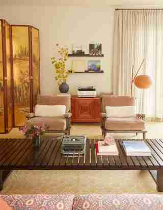
Imbuing the home with a sense of music was also paramount. In the living room, that meant adding a vintage cabinet with a record player. (“They’re not big TV people, but they are music people,” Redmond Warner says.) Elsewhere, the design team was inspired by Stefan Sagmeister , an Austrian graphic designer, typographer, and Grammy Award winner whose firm designed album covers for The Rolling Stones, Jay-Z, The Talking Heads, and more. “Sagmeister wrote a book about his studio,” Redmond Warner says. “Every day they would play four records twice, and he would display the four records as if they were art. That was a big source of inspiration. It looked so great, so we were like, why not display album art? It conjures music into the visual when you can see what’s playing.”
Inside the music room, which also serves as a recording studio, Farrow & Ball Inchyra Blue paint was employed to deft effect while a portrait of Paul McCartney helps anchor the space. Here, the client hosts jam sessions around a vintage wooden L-shaped desk that functions as a DJ booth. “So it’s cushy down here,” Redmond Warner says. “The art, the instruments, and the vibe speak for themselves.”
“Decorating a house for a man is ever so slightly different because you don’t want it to read as overly feminine, but you know, this person, this client, was in need of a soft, nurturing place to be in during this phase of his life,” Redmond Warner says. “I think the way that we were able to make it cozy and warm without being too floral was to lean into primary colors. When I look at this house, I see that everywhere. I’m like, Oh, there are reds, there are blues, and there are yellows. It’s kind of a thread that keeps things from getting too saccharine... It’s definitely visible, but it’s not too much.”

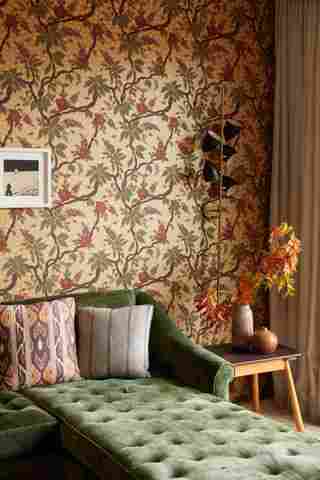
“This room looks out over the Presidio,” Redmond Warner says of an area of the home that was inspired by Wes Anderson’s The Royal Tenenbaums . “We wanted to do quiet upholstery and printed wallpaper so it has the effect of making the room feel very cocooned,” she says. “The sectional is enormous and can accommodate many people at a time.” The floral wallpaper is Zak+Fox , the print pictured is from Patrick Parrish Gallery , while the sconces are Vintage Stilnovo.

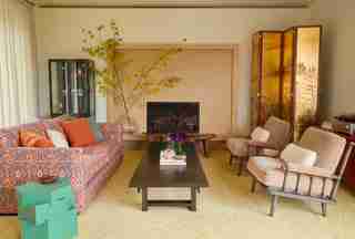
The living room includes a mix of furniture found at Nickey Kehoe on a Los Angeles shopping trip. Subsequent reupholstery (in part with Jennifer Shorto fabric), as well as a custom wood Go Build Studio coffee table and de Gournay screen, help anchor the space. The side table is from B.Zippy . The fireplace was refaced with marble in order to give the room a more modern and streamlined appearance.

Here, the aforementioned album art can be seen. The Pendant Globe Light is Hans Jacobsen, and the teak cabinet is from Lief Gallery . The chairs were purchased through Nickey Kehoe.
The kitchen is part of the home’s open plan. The stools seen are Skylar Morgan .
Art by Megumi Aria strikes a blue note in the dining area. The table and chairs are from JF Chen . The sideboard is a custom piece by Go Build Studio.
“We kept the existing paneling,” Redmond Warner explains of the primary bedroom. “It felt rude to pull it out because it is very beautiful. And then once we kind of started layering things that felt more colorful and softer, it just became something so lovely.” The bedside tables are from Lawson-Fenning , and the sconces are Apparatus . Josef Albers artwork, a Mansour Modern rug, and a vintage sofa sourced through 1stdibs are additional standouts.
The walls have that kind of futuristic paneling which brings the outdoors in. “We kept the entire wall of paneling that hides the TV,” Redmond Warner says. “You can kind of see it behind the Arne Jacobsen Swan Chair.” The cube seen is from Galerie Half .
“Our client was very motivated to make the house as wonderful as possible for his kids, prioritizing their bedrooms over his own,” Redmond Warner says. “And he knew his boys would appreciate a camp-like bunk experience, so this was actually one of the first things we designed for the house.” The curtains were made out of Zak+Fox fabric.
“The Farrow & Ball Inchyra Blue is just the weirdest color—it feels very saturated and rich,” Redmond Warner says and then laughs. “We don’t know what it wants to be. Is it blue? Is it green? I think it really makes the room.” The photograph was taken by Linda McCartney.
“This pocket courtyard is a meditation cube!” Redmond Warner says enthusiastically. She was inspired in part by the work of Donald Judd. “We added a tensile string installation that moves with you as you pass through the house. The benches are heated, and the mineral specimens I bought from an amazing rock shop in Montana. The energy in this space is unreal.” The chairs are Galanter & Jones .