Step Inside the Coolly Neutral SoHo Oasis of One Former Navy Seal
Interior designers must balance competing priorities—be it packing a home with color while keeping things serene, or crafting an abode that is at once on trend and brimming with personal touches. And then there’s the classic conundrum: To gut a space or keep the charming, yet crumbling, original details? Only the best can find a way to strike somewhere in between without hitting a sour note, creating a cohesive mélange that works in concert, however unexpectedly.
In a historic loft in SoHo, Manhattan, designer Augusta Hoffman toed the line between several demands effortlessly. Her client, a former Navy SEAL who was new to New York City, snapped up a storied apartment that was once a hub of the city’s downtown art scene (and previously owned by Adam Levine ). Hoffman brought a new level of sophistication to the loft-style space by reorienting the floor plan and mixing furniture by design-world darlings with striking contemporary art pieces, creating a home where each object feels intentional but not at all minimalist.
“I think the space is so architecturally layered that you could get away with minimal furniture—you could just do like one amazing slipcovered sofa and be finished,” Hoffman says. “But the client really wanted something that felt kind of bohemian and super layered, so I think we found a nice balance.”
The home’s entrance is the epitome of that balance. Hoffman dreamt up a tranquil entryway, with a curving vintage Italian mirror mounted over a simple Japanese bench. But about halfway through the project, the client went to Burning Man, and returned with some new ideas. “How are we going to layer in his love of Burning Man with this?” Hoffman wondered, until sourcing an abstract Jochen Holz neon—placed atop the bench—to add a touch of fantasy.
It helped that Hoffman and the client are longtime friends, having both grown up in Texas. “I think from day one I understood his vision, but also his past relationships with interiors,” Hoffman notes. When the client would mention a specific chair in his childhood home, Hoffman knew what he was referencing. She even brought a few pieces from that Texas home to SoHo to create a sense of comfort.
As a former Navy SEAL, the client didn’t have a trove of material possessions in storage to create his home. But designing this space inspired him to start collecting pieces of his own. “We started fresh on everything,” says Hoffman, who also enlisted Illa Gaunt , an art advisor based in Texas, to source the artwork by the likes of Monica Kim Garza and Perle Fine .
The gem of a loft wasn’t without challenges. Hoffman had to peel back layers to let the architecture shine through. When the space was purchased, office partition-style walls broke up the floor plan. Non-original exposed brick clad the walls. Even the iron columns—a quintessential SoHo feature—were coated with dozens of layers of thick paint. Hoffman wanted to emphasize the original features while obscuring the add-ons. She painted the brick walls and any other unsightly elements white, while stripping down the columns and painting them black, along with the original window frames.
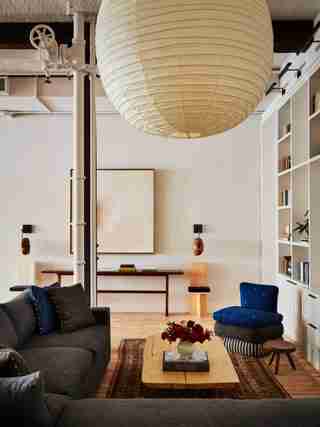
Within the open floor plan, Hoffman also needed to make each space feel distinct but still work together visually. Three massive Noguchi lanterns hang over the dining area, kitchen, and TV area, making them all feel like their own rooms, despite having no walls between them.
To make the kitchen blend seamlessly, Hoffman stayed away from shiny appliances. “Having a chef’s kitchen in the middle of your living room seems a little strange, so I wanted to keep the millwork feeling really furniture-like,” she explains. She used walnut countertops and painted the cabinetry dark to evoke the feeling of a chest of drawers. The French oak handles are even wrapped in leather for a masculine look, while glamorous elements like the Arabescato marble bar and shearling, Royère-style counter stools have their own place too. Hoffman says, “I think we were able to find that balance together.”

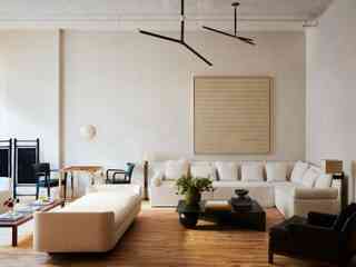
In the living area, a suite of monochrome furniture creates a peaceful space. A Perle Fine artwork hangs above the custom sofa, which edges the custom Luke Todd coffee table. The daybed is Dmitriy & Co. and the black leather chair is vintage Harvey Probber .

Oversized Noguchi lanterns create the illusion of distinct spaces within the loft. Hoffman sourced the fabric for the chair and pillows in the TV area with ASH NYC. The firm also designed the chair itself.

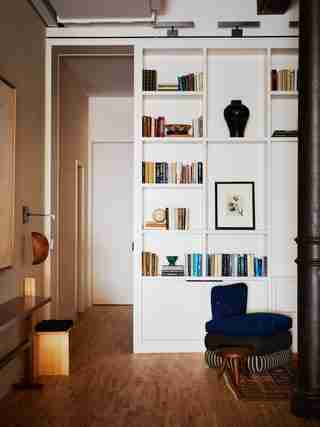
The custom built-in bookshelf that stretches from floor to ceiling artfully divides the common areas from the bedroom. Chair by ASH NYC .
The home has a black-and-white backdrop scheme to let the furniture in each space shine.
The same Arabescato marble used in the primary bath is seen in the bar area to create a sense of cohesion throughout the home.
Antiques and contemporary pieces join together in the dining area, overlooked by a painting by Monica Kim Garza . Carlo Scarpa chairs surround a Ruemmler table, while another nearby piece comes from the client’s family home.
The entryway combines eye-catching objects and art, including a neon piece by Jochen Holz from the Future Perfect that nods to the client’s love of Burning Man.
Hoffman reoriented the primary bedroom so the bed faces the windows. “One of the best parts of this apartment is the natural light,” she says.
Arabescato marble is woven throughout the primary bath. The serene space features a Victoria + Albert soaking tub with Waterworks Easton shower and bath fittings.
An antique Indian bed anchors the primary bedroom. The bedding is Jayson Home and the custom lumbar pillow is Loro Piana .
In the guest bath, a Josef Frank mirror and Studio Dunn sconce are set against a dark, plaster-finished wall by Portola Paints . “It's a small space, which, I think, in design lends itself to doing something a little bit more dramatic,” Hoffman says.