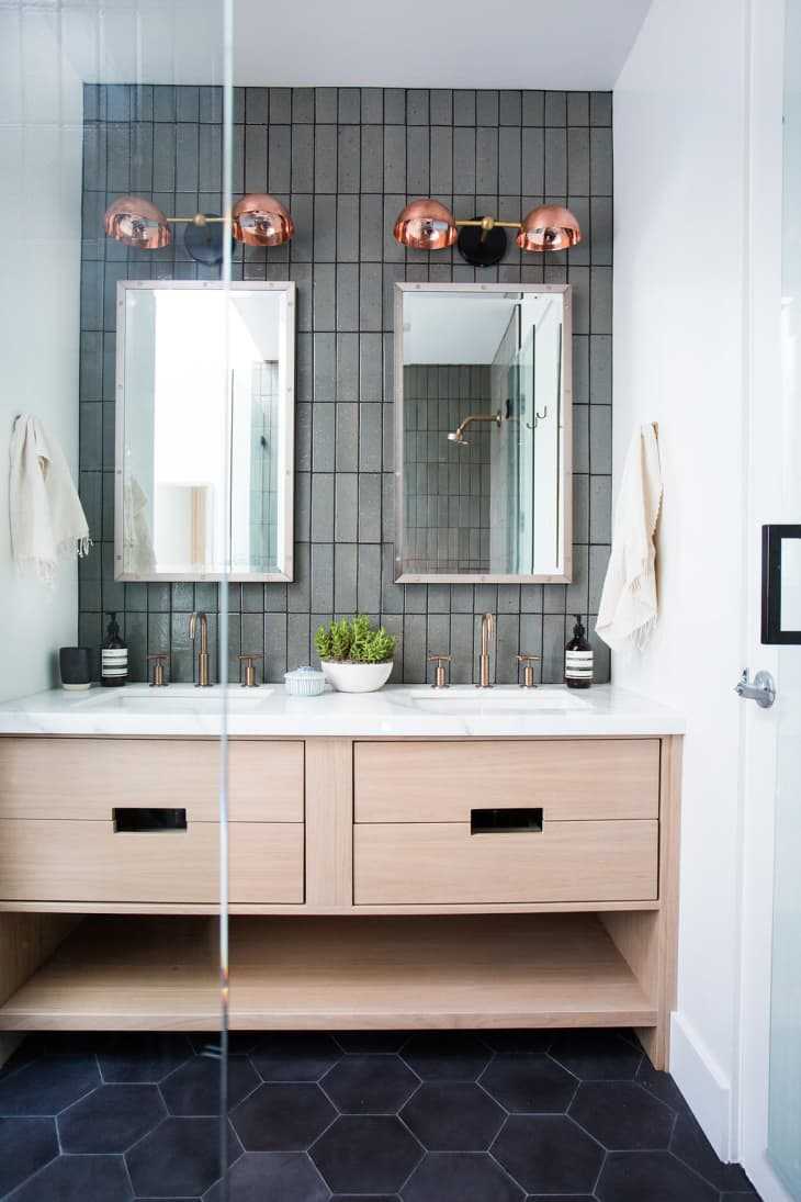
This Big Bathroom Trend Turns Traditional Subway Tile on Its Head
Subway tile is popular for a reason: It’s beautiful, it’s classic, it’s inexpensive, and it goes with pretty much anything. But as a design trend, it can also feel a little bit overplayed. If you’re drawn to subway tile but are looking for a bit of a change from the look that’s absolutely everywhere, we’ve found a way to make subway tile feel fresh again (and also, conveniently, a way to avoid associations with, well, the subway).
If you haven’t already guessed, here’s our brilliant subway tile hack: Turn it around . Typically subway tile is laid like bricks, with the long side horizontal. Just stand it up, and you have something completely different.

This design by Amber Interiors uses colored subway tile in a brilliant way: turned vertically, and stacked (so you don’t get the offset you’d see from a typical running bond). The result is very modern, and pleasantly unexpected—a whole new way to look at a time-honored classic.
Here’s more stacked tile (this looks a bit thinner than your typical subway tile) in a bathroom by Sean Anderson Design . I love how the modern feel of the stacked tile creates a beautiful contrast to some of the more traditional elements in the room.
Don’t like the stacked look? There’s still a lot to be gained from turning your subway tile on its side. The tile in the bathroom of Sophie’s Australian home is just your typical subway tile, laid in your typical running bond, but since the whole setup is rotated 90 degrees, the look feels very fresh.
Here’s a similar setup in a bathroom by Solstice Interiors . Turning the tile draws the eye up, helping to make a small bathroom seem more spacious.
Here’s the stacked look in a bathroom by Breathe Architecture . The vertical tile continues throughout the space, emphasizing its height and adding an unexpected, sculptural element.
This lovely powder room, from The Stables , has a wall of vertical subway tile. The slightly rippled texture of the tile adds another unexpected element, and gives a very modern space an extra dose of warmth.
This bathroom from By Bruno (also pictured up top), has vertical subway tile, with one big difference from the designs above. Instead of being offset vertically, this tile is offset horizontally, which adds a distinct modern twist. (These tiles look like they also might be a bit larger than your typical subway tile.)
Design Alanna Dunn of Reena Sotropa In House Design Group created this bathroom, with a tub surround of vertical subway tile laid with a horizontal offset. It’s a look that walks a nice line between classic and modern—the best of all possible worlds.
Related:
Badass Ways to Use Subway Tile in the Bathroom
7 Times Subway Tile Looked Anything but Boring
How To Make Cheap Tile Look More Expensive