Tour the Soothing SoHo Pied-à-Terre That One Designer Created for Her Family
When you frequent a hotel so often that the hotel begins renovating rooms to accommodate you and your family, perhaps it’s time to start looking for your own place. That epiphany is what inspired the Chilean-born, San Francisco–based interior designer Maca Huneeus to search for a Manhattan pied-à-terre back in 2017.
Once the need was realized, Huneeus moved fast, setting her sights on a then new construction bordering SoHo and Tribeca. “It was the natural light and the Gaudi-esque curves that caught my eye,” she admits. But the building’s modern spaces and sculptural aluminum façade couldn’t have been a bigger departure from the “funky, New York City–loft vibe” she’d envisioned. “For one,” she says, “there wasn’t an exposed brick wall anywhere.”
Instead, the 2,700-square-foot apartment had floor-to-ceiling picture windows and curving plaster walls that give the space an unexpected softness. Ultimately, the decision came down to convenience. “I wanted something turnkey that we could start using immediately,” she says. Aside from a few minor updates—trading what she deemed to be excess closet storage for more livable square footage—the family of six was able to gather at their urban retreat in a matter of months.
What the building lacked in old New York character, though, Huneeus planned to make up for in thoughtful design choices. “My philosophy,” she says, “was vintage, vintage, vintage.” The designer leaned heavily into obscure collector’s pieces, pulling an eclectic mix from her international Rolodex of sellers—a Pierre Chapo “Eye” coffee table, Osvaldo Borsani’s Canada chair—and sourcing items on 1stDibs (the Maison Lunel sconce and a Harvey Probber dry bar, for instance). “I just couldn’t imagine putting a lot of ‘new’ in there,” she explains. “It needed soul. These vintage pieces give it that.”
Huneeus comes at her love of vintage authentically. The daughter of a collector and an architect, she spent her weekends as a young child meandering Santiago’s oldest antique haunts (the Galeria Carroza, Taller del Marco) with her mother. “None of my siblings were ever interested in it,” she remembers. “But me, I could go without breakfast, without lunch, without anything. I was already so passionate about design.”
She recalls the first piece she ever truly fell in love with, a painting by Delia Del Carril, the wife of the Chilean poet and diplomat Pablo Neruda, that still hangs in her mother’s living room. “The scale of it is almost overwhelming,” she says of the graphite horse painting that appears to race across a wall. “It’s unforgettable.” Her strong feelings for that painting made her realize she was different from other 12-year-olds. They didn’t share her passion for art and objects or have an eye for recognizing the wonderfully unique.
Decades later, those qualities are the reason clients seek her out: her ability to curate a seemingly disparate mix with ease, to scour the global markets for beautiful pieces by lesser-known designers and artists. In her own space, that meant pairing Finnish lighting by Lisa Johansson-Pape and handwoven textiles from Nepal with art by close friends—always under the guise of livability. “My family is a shoes-off, feet-on-the-furniture sort of family,” she laughs. “When we’re here, we like to hang out, lounge, be together. Everything about this apartment facilitates that.”

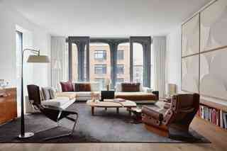
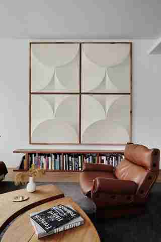
The living room is a carefully curated balance of comfort and character. Huneeus’s vision began with a custom silk rug from Nepal and a Minotti sectional. She then layered in collector’s pieces: Pierre Paulin’s lounge chair, Osvaldo Borsani’s Canada chair, and an Eye table by Pierre Chapo.

In a room full of crisp white walls, an installation of vintage wood paneling from the ’50s—procured from a dealer in Paris—adds beautiful texture. Below, a custom bookcase by Andrew Woodside Carter houses the family’s collection of art books.

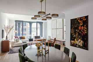
The oval dining table has a tulip metal base and is surrounded by a set of Carli de Carlo dining chairs, all procured at Wyeth . The pairing is both grand and delicate, as the pieces appear to float at the center of the open living space.
Proof that the best design decisions often happen on a whim, Huneeus casually mentioned to her artist friend Sebastian Errazuriz that she wasn’t sure what to do with this nook in the apartment. “Then,” she recalls, “he stood up and began painting on the wall.”
The nook doubles as a second living room when two generations are under the same roof. As for the banquette, it was custom-made in San Francisco by Andrew Woodside Carter and covered in a rose-hued velvet.
As a refreshing departure from the norm, Huneeus let the kitchen disappear into the background. “It’s there. It’s functional. It’s just not a focal point,” she says of the open space. She made one exception, a section of open shelving that houses her collection of Jono Pandolfi ceramics.
The island is made from molded concrete and feels like a curving statue in the center of the apartment. Huneeus found the counter stools at the Future Perfect .
A collector of Josef Frank’s brass work, Huneeus hung one of his sculptural mirrors against bold wallpaper by Élitis in the powder room.
For the primary bedroom, Huneeus wanted a space that felt completely different from her home in San Francisco. She designed this custom walnut bed—created by Andrew Woodside Carter—to sit low to the floor with built-in side tables. The photograph is by Annemarieke Van Drimmelen.
Huneeus’s first encounter with this rare Alfred Hendrickx for Belform piece happened in a New York showroom, and it was absolute love at first sight. “It felt like Picasso in a credenza,” she recalls. After much scouring, she found her own on 1stDibs .
The primary bath came together with just a few pieces: a vintage African chair, a German light fixture purchased on Pamono and a photograph from friend Annemarieke Van Drimmelen .
Strategically cut holes allow light to shine through a marble wall in the primary bath.
In a room shared by Huneeus’s oldest daughters, a set of Room & Board headboards are covered in a custom yellow velvet, a tiny tweak that made something basic feel truly special. The cubist painting was found on Etsy .
Simple, pared down, and very functional, this bathroom is a high-traffic zone when the entire family is in residence. The floor-to-ceiling marble tiles are as beautiful as they are easy to maintain.
The colorful throw pillows are part of a haul Huneeus picked up on a past trip to Madeline Weinrib . “I went in to look around,” she says. “I walked out with ten pillows.”