Inside an Alluring Victorian Revival by the English Coast
Although in some quarters it is considered unfashionable, there’s a lot to be admired about Victorian design. They were the original maximalists, who favored the romantic and eclectic with a mash-up of historic styles. They knew how to do all things decorative.
Structurally magnificent with amazing proportions, this 1879-built house has all the commanding characteristics of the period, but there’s something different going on here. Any hint of Victorian stuffiness is countered with streamlined contemporary design, and the private rooms upstairs feel soft and intimate in contrast to the open spaces on the ground floor.

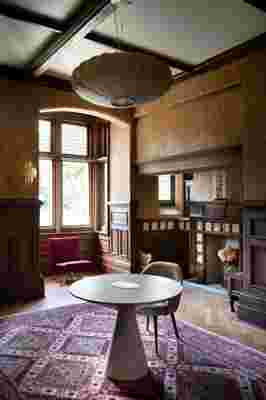
In designer Scarlett Gowing's study is a circular table by Portuguese firm HMD Interiors with a vintage 1950s George Nelson lamp hanging above. “The light is enormous,” she says of the choice. “It’s about 35 inches wide, but because of the scale of the room, everything has to be upsized or it gets completely lost.” The Murano glass wall lamp is by Fiona McDonald and the Oriental rug was bought by Gowing's dad over 50 years ago. “It has been in every house I’ve lived in,” she says. “It looks most at home here.”
Taking on the renovation of this house in St Leonards-on-Sea in East Sussex, interior designer Scarlett Gowing had quite the challenge. The near-derelict Grade II—listed property has endured many incarnations over the years (it has been a convalescent home, language school, and drug rehabilitation center) and in the process lost any semblance of the family home it once was. Also, the spook factor was high. "It was a big ask," says Gowing of how she tackled the renovation. "The house had lost its soul: All the stained glass was broken and boarded over and a lot of the doors were bricked up to create smaller rooms." So she went back to the original floor plan to bring the house back to life.
Gowing started by ripping up the institutional carpet and sanding the floors. The remaining stained glass, fireplace tiles, and wood paneling gave her a lot to work with. "All of this needed to be softened and balanced out," she says, and the key was high contrast. For instance, take the earthy Kelly Wearstler wallpaper in the study paired with the 1950s George Nelson lamp. "In terms of decoration, the house can carry these bolder pieces—I wanted a simple palette with a bit of punch," Gowing says. "These pieces are strong in their own right but don’t conflict with the stained glass. It works."

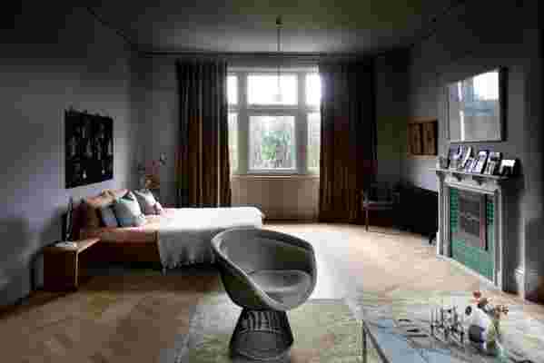
The bedroom is Gowing's sanctuary and place to unwind. The warm shades of bronze and gold are muted, complemented by pieces such as the Knoll Platner chairs. Next to the bed is a vintage flower light by Hans Kögl and Zeitraum bedside tables.
Downstairs, the large space flows through the living room, a small dining area, and a sunny kitchen—a 1960s addition to the property from its nursing home days. With its curved counters and textural Japanese washi wallpaper, this is an ultimate example of how to contrast period features with high-end contemporary design. Given all the ornate woodwork, the simplicity works well. The house has all the glamour of a boutique hotel with the subtle vibe of Virginia Woolf.
The ultimate resource for design industry professionals, brought to you by the editors of Architectural Digest

Gowing, who moved from a fashion career into interiors, has an innate knack for sourcing exceptional vintage pieces, as well as creating the sumptuous textiles seen throughout her home. Instead of making dresses, she now makes curtains and cushions. It is all very hands-on and tactile, especially in the bedroom, where cozy bronze velvets and touches of gold coordinate with the Cristina Celestino swirly pastel carpet of the adjoining dressing room. In this space, the elegant mirror is one of Gowing's own designs, which will be included in a forthcoming product collection. "I design items that are close to my heart," she says of the mirror and also the plastered pendant lights that add cool to the living room. "In creating things for my own house, the collection has evolved."
As in every good interior redecoration, there is an element of piecing together and working things out. But when you have a majestic space like this to play with, it is a dreamscape for design. There is plenty of freedom to create.