Inside the Design of NYC’s Most Stylish New Restaurant
Having created stunning interiors for hotels (the Chicago Athletic Association, several ACE properties, Greydon House in Nantucket, Massachusetts) and restaurants ( Le Coucou , Upland, La Mercerie), AD100 designers Stephen Alesch and Robin Standefer, founders of Roman and Williams , are no strangers to the myriad challenges surrounding hospitality design. Their firm’s latest restaurant project, Veronika , inside Gramercy’s new Fotografiska (a branch of the famed Swedish photography museum), opened this week and is likely already popping up all over your Instagram feed.

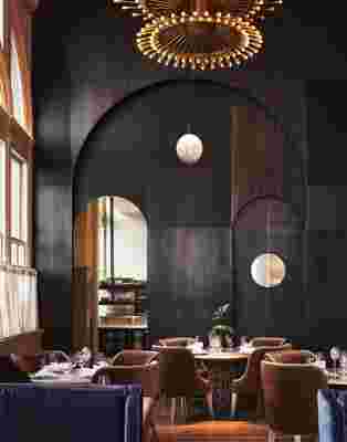
The back dining room with a view into the kitchen at Veronika, featuring blackened brass doorways and brown mohair, arched-back chairs. An RW Guild Globe light hangs in the background.
Located on the second floor of the iconic Renaissance Revival building, the generous scale of the dining space and its arched windows and high ceilings immediately won over the designers, who worked in concert with the restaurateur Stephen Starr. “When we began working in the space Veronika inhabits, it was a demolished shell with inspiring structural bones which we reenvisioned with respect and innovation to the historical 1894 Beaux Arts Church Missions House,” Alesch tells AD . With a building so historic, the New York City Landmarks Preservation Commission, of course, placed restrictions on what could be done, but, fortunately, the husband-and-wife team intended to keep those details intact from the beginning. “For example, the native stained glass window we rescued and used as part of the wall in the bar area—we were required to use all of the massive stained glass windows, and the Landmark Commission loved our idea of repurposing one into a wall,” says Standefer. “Also, the repair of the beautiful plaster ornament around the windows was required, but something we intended to [do] anyway.”

The moody hand-painted forest-themed mural, by New York–based painter Dean Barger, gives a mystical vibe to the bar and lounge area.

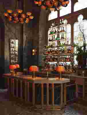
A Black St. Laurent marble bar and stained glass window alongside custom lighting adds intrigue to the cocktail area.
Drawing inspiration from the Art Nouveau movement and the grand cafés of Vienna and Budapest, the restaurant showcases a range of Eastern European styles and ideas. In the bar, a bohemian forest landscape mural by New York–based painter Dean Barger, similar to the one at Le Coucou’s entry bar, contrasts with a honed Black St. Laurent marble-topped surface and a stained glass window inlaid into the wall. “We have always been interested in the cusp of an era, a period where styles are in transition, and that is what the mural at Veronika communicates,” says Alesch. “Through the mural, design, and decor of the bar area, we heightened the tension between the two with earthy and cyan tones and a composition reminiscent of the early and not frequently recognized work of Piet Mondrian.”
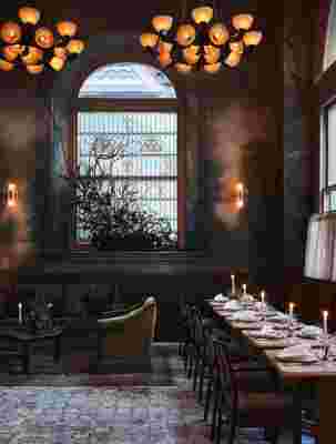
Opulent brass chandeliers offset the natural light that floods the dining room, while curvilinear mohair seating adds sex appeal.
The ultimate resource for design industry professionals, brought to you by the editors of Architectural Digest
Rounding out the overall design are custom brass chandeliers (part of a lighting scheme conceived by the duo that “emulate crowns with tiny points of light”), a natural color palette, pale oak floors, wood-trimmed arched doorways, and curvy, arched mohair seating. “The deliberate palette contributes to the otherworldly experience of the space with a combination of deep greens and cyans and dusty oranges and creamy vanilla,” says Standefer. Polished Rosa Perlino marble tabletops feature custom egg-shaped lights casting the perfect mood while one devours Eastern European staples like escargots, Wiener schnitzel, and lamb goulash with spaetzle. Even the bathrooms, with their elegant 1940s Italian pastiche of moody red-, purple-, and blue-hued stones are sexy and alluring. A must, after all, in this age of clandestine mid-meal selfies.