Inside the Rise of Emotional Design
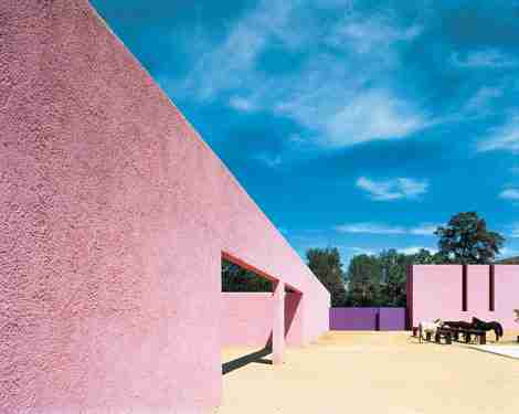
The term “emotional architecture,” properly attributed to Mexican architect Luis Barragán and sculptor-painter Mathias Goéritz, who together published an eloquently worded manifesto in 1954, looked for spiritually uplifting buildings that served as a foil to a somewhat sterile modernistic approach. “I have worked with total freedom to make work whose function is to produce emotion,” Barragán wrote. So his oeuvre embraced colors, light, and shadows with the bravura and delicacy of an impressionist painter, encouraging visitors to meditate and reflect.
In an increasingly digital era that has a tendency to create a sense of isolation, architects and designers are recognizing the intimate relationship an individual has with his or her immediate physical surroundings. Architects are increasingly becoming poets, creating memorable spaces that calm, energize, uplift, and create happiness.

Beijing-based Ma Yangsong, founder of MAD Architects , says that even though humanity has designed a rectilinear world, a house is not a machine for living in. His sinuous Harbin Opera House , which opened in December 2015 in the wetland landscape surrounding the Songhua River in China, has a rather frosty-looking lobby. Its gentle opulence of natural light working with crystalline glass curtain walls and pyramids reference snow and ice. Together, it evokes feelings of frigidity, a nod to the city’s winter environment.
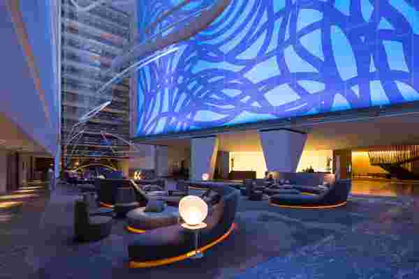
Feelings have suddenly become more germane, and some designers are aiming to create spaces that make one tremble, sigh, or fall into a trancelike state. French lighting designer Hervé Descottes created a dreamy quality in the lobby of Conrad New York hotel through orb-shaped LED lights that fall on Sol LeWitt’s Loopy Doopy mural, with tones ranging from deep blues to purples every 20 minutes: The doppler effect creates a sensation similar to being at the theater.

There was a movement a few years ago when every aspect of design had to be technology-driven, but Darrel Long, design director at Hirsch Bedner Associates (HBA) says that this mindset has shifted a bit. Simplicity, which is the basis of modernism, is what people emotionally respond to in order to become calmer. “Certain materials like stones and slate tend to make our bodies feel better because they are completely natural,” he says. “In contrast, manufactured things tend to be colder.”
Long is currently designing the Dream Palm Springs in California, with a focus on making the staff feel uplifted about where they work so, in turn, they can pass on those positive vibes to guests.

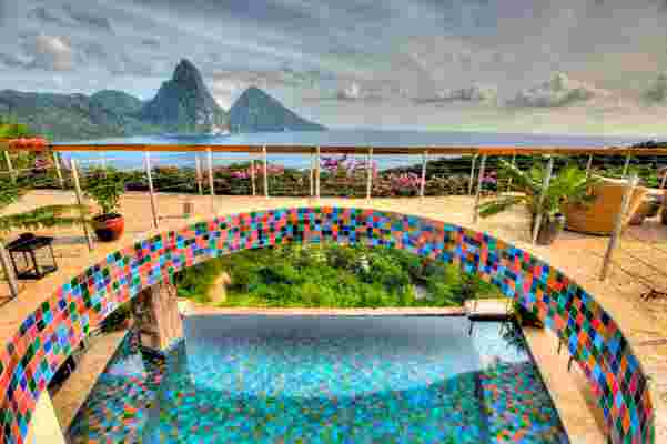
Color is another way of accomplishing an emotional dialogue: At Jade Mountain in Saint Lucia, designer Nick Troubetzkoy chose prismatic glass tiles with textured iridescent surfaces to line the suite’s infinity pools, lending them a shimmering, Rubik’s cube-like effect. This color scheme extends into the rest of the rooms' personality, and guests often request accommodations in a specific hue.
The use of raw textures can be found in spades at the recently opened 1 Hotel Brooklyn Bridge in Brooklyn, where light pours in from wraparound floor-to-ceiling windows in an open-air-like design, blurring the lines between indoors and outdoors. Kemper Hyers of Starwood Capital, designer of the hotel, says there was a lot of attention paid to creating an ambience using unprocessed materials, such as unfinished wood reclaimed from New England factory buildings, which have an honesty and purity to them, as well as warm lighting that signals the brain to calm down.
The steel stair shows tab welds and even bootprints from the installation because such details telegraph the human interaction that made the pieces. “People subconsciously relate to that on an emotional level,” he says.