Manhattan Reinvention
View Slideshow
The brief for the Park Avenue apartment could not have been simpler. As James Huniford, who designed the pied-à-terre with his partner, Stephen Sills, remembers, the direction from the clients was clear: "The only objective was to make a beautiful setting for their collection of modern art."
But as so many noted designers have discovered in commissions for galleries or museums, art can be a most demanding occupant. Complicating the project was the caliber of the art in question—the collection includes Picasso's Dora Maar —and one caveat from the clients, who are prominent New York philanthropists. "They wanted it to be a home, not a gallery," Huniford says.
Out were those universal SoHo shibboleths that designers often retreat to when faced with a space to be dominated by art—stark atmosphere, white walls, intrusive lighting. In their place Sills and Huniford had to attempt a much more difficult feat: finding the common ground between disparate artworks. They turned to color and texture to bridge the gap between the Calders and Warhols and Mardens and Klines. Even in the entrance hall, the area devoted most exclusively to art, the vitality of a bull's head by Joan Miró and the brooding symmetry of a verdigris pre-Columbian mask are resolved against the wire-brushed, lavender-stained oak-veneer walls. A chrome-and-translucent-marble light fixture by Jacques-Emile Ruhlmann, an iron-and-marble table by Gilbert Poillerat and the gridded stone floor temper the warmth of the walls and establish the space's deliberate severity.
Such foursquare formality ends at the door leading to the living area, however. "We didn't want it to have that cold feeling," Huniford says, evoking in his emphasis an enfilade of a thousand gallery-white rooms. "We felt it was more interesting to create a kind of textured palette." That palette ultimately came to include walnut floors, hand-finished walls, custom-made carpets, hardware and lighting, iridescent window shades, a profusion of Art Déco furnishings, the clients' art, an eye for coincidence and contrast—and that curator's taboo, rich color.
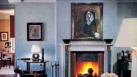
The living room, entered through a pair of paneled walnut doors, employs all of these things. Visitors are met by a Botero bull on a gold-leafed table, set off by an Eileen Gray screen. A few more steps lead to an intimate seating area with chairs and tables by Ruhlmann and a scattering of Calder stabiles, complementing a larger wall-mounted Calder construction in piano wire and wood. The whole is wrapped by gray hand-rubbed Venetian plaster walls that flare to blue in the sun. These colors were first suggested by the wife, who directed Sills and Huniford toward hues at the intersection of gray, violet and taupe. The bowls of flowers that she has added throughout the apartment echo those tones, which are picked up again in the tulip pattern of the living room carpet and in its muted lavender draperies. At the room's center is a fireplace, tended with Alberto Giacometti hearth tools and framed by a Picasso and a set of Just Andersen's bronze bowls. There, another cheeky texture is added: a touch of classicism found in the marble fire surround and in the merest hint of a geometric motif that runs at cornice height around the room.
That device suggests one aspect of the designers' mission: to make the rooms seem even larger than they already were. Sills and Huniford used shading and color to create the illusion of space wherever it was needed. The building was once a hotel, and the clients' apartment was constructed from twelve rooms, which gave the designers an opportunity to define spaces from scratch. "It was as much an architectural challenge as an interior decorating challenge," Huniford says. While they were free to design gracious square footage, they wanted to add to the sense of verticality as well. "We just tried to lift everything, " says Sills, with a palms-up gesture.
The geometric motif marks a change in color and texture about a foot below the living room ceiling and, by suggesting that the wall is a kind of folded screen, gives the impression of added height. In the small study immediately beyond, that effect is repeated: Oak panels stop short on the wall so the white ceiling can float above. In this room, on the bright east side of the apartment, the colors drift more to white, but the guiding palette can still be discerned in the shagreen of an André Groult chair.
In the dining room, adjoining, the blanching of the space continues, and one of the extremes of the designers' palette is introduced: The room is sheathed in a meticulous wrap of ivory paper—what Huniford refers to as "a parchment envelope." The door to the kitchen and a bank of china closets are concealed behind the panels, which are detailed so that the rhythm of the one-by-two-foot sheets is never broken. All of this rigor and restraint highlights the room's long custom-made table, horsehair-upholstered Ruhlmann chairs and violet-toned 1935 Murano glass chandelier. A nude by Jacques Lipchitz reclines on the window ledge overlooking Park Avenue, eleven stories below.
The apartment's bedrooms are discreetly set apart from the public spaces. Immediately to the left of the entrance —just past the Warhols—a small vestibule serves as the gate to the private wing. One door leads to the master bedroom and its attendant dressing rooms, and another to a suite of guest bedrooms. As in the rest of the apartment, a barely tamed exuberance of textures is the rule.
The master bedroom is reached at the end of an L-shaped hall, the walls of which are finished in a diamond-patterned ivory horsehair fabric. The bedroom itself is lined with bark paper, which gives the room just a suggestion of roughness—a theme echoed by the custom-made bronze-and-leather bed. Again, the wall treatments stop below the ceiling in an effort to maximize the perceived size of the room. Two cork screens by Eileen Gray frame the windows and help accentuate the room's hushed feeling. The adjoining master bath is home to more curiosities: a pressed-straw dressing table by Saint-Gilles and a Tiffany dressing mirror in mother-of-pearl mosaic.
To give the guest bedrooms an air of independence from the rest of the apartment, Sills and Huniford handled each as a sort of case study, breaking from the logic they established elsewhere. In one of them is a sporty fantasia of vertical stripes; their color—gray—is the only thing linking the room to what has come before. Another guest bedroom is a study in the possibilities of lacquer paint, a treatment that reappears in a small children's den, off the kitchen, at the opposite end of the apartment.
In pursuing that simple brief—to make a home for the art—without recourse to the status quo, Stephen Sills and James Huniford were forced to synthesize a middle ground between the art and the spaces it would occupy. At each point they had to balance the vigor of the individual artworks, the themes they had established to bind them and the perceptual problems posed by the space. They responded with their own collage in three dimensions. As Huniford says, "The clients wanted a really extraordinary thing—which they got."