Remember the #10YearChallenge? Here Are the Paint Colors to Match Your Old Selfie

Do you remember the #10YearChallenge that was going around earlier this year? The “challenge” asked that people post a photo of themselves from 2009 next to a photo of themselves in 2019. It was a cute way to reflect and mock our tastes from a decade prior . Then it divulged into one meme after another and honestly, some of them were downright brilliant. Well, the challenge has shape-shifted away from memes.
The folks over at Clever weren’t interested in posting any then and now photos, but they were totally into using the viral hashtag as an excuse to research paint trends. Working with numbers from Benjamin Moore, they analyzed the best-selling paint colors for 2009 and 2019 . They broke the popular paints down into color-coded categories like neutral, white, blue, green, pink/red, and orange/yellow.

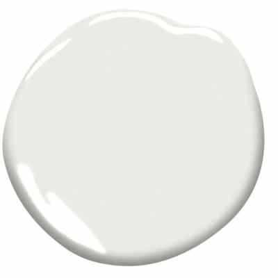
Among the whites, White Dove amazingly held the number one spot for all ten years. While it’s astounding to us that the same exact white would be the top-seller each year for a decade, this is a good white. It’s bright enough to open the space up in a way that a creamier white can’t while still retaining the tiniest touch of color to make it easier on the eyes.
The blues got darker over these years…
and the greens got lighter.
The most popular pink/red was the same in 2019 as 2009 and it’s Caliente AF-290. This deep crimson is everything you think of when imagining a slightly darker twist on primary red. It’s not a fire engine. It’s … blood, rubies, velvet-gown-worthy.
The rest of the color reports are also fascinating. You can check them out here .
And while our favorite yester-decade colors aren’t quite as personal as photos of our faces, there is always something reliably humorous in the aesthetics we once adored. Which has to make you wonder: are we going to hate everything we love now in 10 years? Is there a way to break the #10YearShameSpell?!