Step Inside a Chic London Town House Where Color and Parisian Charm Help Cure the Blues
The house had its charm. But could it be an antidote to dreary London weather?
Wider than the typical London townhome, the Notting Hill abode afforded the type of lateral living that the wife had grown accustomed to from years spent dwelling in Paris. And the rear of the house opened out onto a communal park, which, during lockdown, would prove to be a haven for the family of four and their Australian labradoodle. But the ultimate selling point was the light—a natural antidepressant against the gray London sky.
“The environment of the house is so important for my mood,” says the mother of the family. “I needed the place to be very happy.”
And so K&H Design, the maestros of the home’s interiors, said “let there be light.” It streams in through a large window on the main living level, pouring into the rest of the first floor starting first thing in the morning. To make that light extend even further, K&H opened up the previously closed-off entry with glazing, creating views to the garden from the moment you walk through the cardamom-yellow front door.
But beyond a happy interior, the homeowners sought a practical one, with a flow that could support an active family. In some areas, like the primary bedroom, this priority shines through: Cleverly placing the bed in the center of the room and floating a wall with built-in storage behind it, the designers devised an area for the husband to quietly get dressed for early-morning meetings while the wife snoozes away. (As a matter of course, K&H studies the sleep and work patterns of their clients to help smooth away pain points in the daily routine.) In the children’s rooms, toys and clothes get tucked away into tidy, generous built-in storage.
“Whenever we can, we always go to the client’s home and actually measure how many linear meters of storage they need,” explains Katie Glaister, cofounder of K&H Design. In the case of this family, that meant extra space for the husband’s collection of guitars, and shelving crafted at the perfect height to display his collection of comic books.
Sloughing off the stuffiness of a more formal interior, the family pursued a mostly open main living area, opting for a bistro-like breakfast room over a traditional dining room. The space leans into an artsy brasserie vibe, with a cognac leather banquette and rattan chairs from Philippe Model . In the adjoining kitchen, the designers continued the theme, installing a mosaic tile floor and accessorizing the island with more rattan barstools.
“They are, you know, very French—very international, very cool, very colorful,” says K&H cofounder Henry Miller-Robinson. “They wanted to bring some of that Parisian charm, but they very much also wanted this to be their Notting Hill London home.”
Part of K&H’s job was to act as editor to the homeowners’ eclectic tastes. “I had lots of ideas and mood boards and pictures,” the wife says. “I like the Scandinavian look, but I also like it super messy, super English, and I like the Parisian look, and I like colors—I’m all over the place. I needed people to keep me focused.”
It’s safe to say that K&H handled the job with aplomb. Throughout, the home balances bold elements—a scarlet, tiger-emblazoned rug in the living room, a candy-colored toilet in the kids’ bathroom—with more serene surroundings, thanks in part to a masterful installation of color. On the ground floor, where furnishings are the most exuberant, that meant finding the perfect shades of white for the walls, trim, and paneling. ( Edward Bulmer’s Plain White was a hero hue.)
Variations on a verdigris color run throughout the home, from the mint of the entry trim, to the celadon of the Pyralave-top kitchen island, to the blue-green of the primary bedroom. But finding hues that activate in the cool London light isn’t a straightforward task, explains Miller-Robinson, K&H’s color whisperer.
“If you take a blue—a lovely Mediterranean Greek blue, or a deep sort of Moroccan Majorelle blue, they’re simply colors that won’t illuminate with the light that we have in London, they won’t have that beautiful essence,” he says. “It’s really about finding the more sensitive, slightly more muted, but still brightened tones that will respond to the slightly duller light that we generally have in London and the U.K.” K&H went in and took colors one step further, adding pops of high-impact color through elements like a kelly green powder room and a jubilant, multihued stair runner. The palettes they developed for the home will also have staying power, explains Glaister: They will be the basis for K&H’s first product line.
“Do you think those children are going to grow up adoring color, Henry?” Glaister muses about the clients’ kids. Both designers agree that, if they do, it would ultimately be the mother’s influence. As for those gray London days? They seem to have met their match, says Miller-Robinson: “It’s just such a happy house.”

A K&H-designed runner winds its way up the central stair of the Victorian home and is met at the entryway by bespoke, confetti-like floor tiles sourced from London Mosaic. The glazed wall near the stair looks onto the living and dining areas and opens up sight lines to the garden.
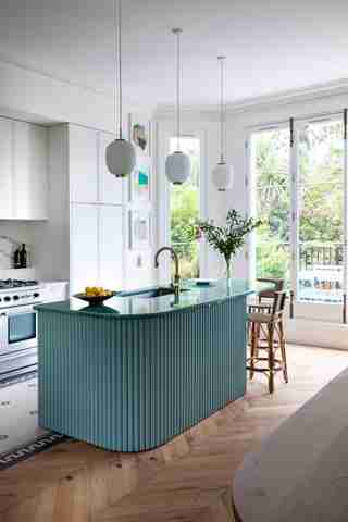
It was this room’s generous natural light and views onto the garden that initially attracted the family of four to the home. Today, it is a nucleus of activity, anchored by a Pyralave-top island in a verdigris shade. (The base is painted with Little Greene’s Pall Mall 309 .) A custom mosaic of Winckelmans tile , paired with Philippe Model bar stools, lend the space a brasserie feel.
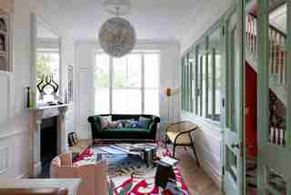
Edward Bulmer paint in Plain White runs throughout the main level, decking the walls, cornicing, and skirting of the living room. Which isn’t to say that color is lacking—indeed, brilliant shades emerge in the minty green window screens (which are coated in Little Greene’s Tabernacle ), in the scarlets of the room’s Marguerite Le Maire rug, and the emerald hue of the Roubel sofa by Pinch . A Charlotte chair by India Mahdavi serves up soft pink, while a dandelion-like paper pendant light by Eva Manz provides more texture.
The family preferred a casual, bistro-like dining area over a rigidly formal space. A custom leather banquette upholstered in Moore & Giles leather wraps around the dining table, which was made by Arnold de Vinck in Brussels. K&H sourced the pendant light from Espace Lumière in Paris.
The family’s collection of Match magazines found their place in the powder room, where K&H opted to paint the walls a high-gloss kelly green. A pendant from Gubi hangs overhead. The vanity is by Duravit , and taps are from Butler & Rose .
The designers opted to bisect the primary bedroom in order to carve out extra storage. Farrow & Ball’s Green Blue decks the walls. Behind the bed, which features Ian Mankin fabric on the headboard, the designers installed a wallpaper mural by Woodchip & Magnolia .
Graphic tile by Popham Design enlivens the floor of the primary bath. Above the Water Monopoly tub, a gold-speckled antique mirror by Rupert Bevan amplifies the room’s natural light. Farrow & Ball paint in Pale Powder covers the vanity, while the walls feature Edward Bulmer Pearl Colour No. 109 .
Elsewhere, another bathroom opts for a confectionary color scheme—even down to the commode. Sourced from Broken Bog , the toilet pairs a cotton candy–colored seat with a sky blue pan. That blue also finds echoes in the bathroom floor, which has been painted into a checkerboard pattern of Farrow & Ball’s Green Blue and Edward Bulmer’s Plain White . The sun-bright shower curtain is from Quiet Town Home .
While the kitchen and dining areas embrace a French bistro vibe, the child’s bedroom feels decidedly British, with its cushions from Liberty London and Ottoline . Wallpaper from Jimmy Cricket lines the bookcase. Overheard, a bird-filled pendant light by Mathieu Challières adds a dose of whimsy. As in other places in the home, K&H maximized the storage through a custom design.