The View From the Top
View Slideshow

Is Wilbur Ross Crazy?" That was the question plastered across the cover of Business Week in 2003. "He's betting big on busted industries like steel, textiles, and telecom," the headline added. "Where others see risk, he sees gold." That provocative cover now occupies pride of place on a library wall in Ross's Fifth Avenue apartment, which was, like those unglamorous industries steel, textiles and telecom, virtually busted when he bought it several years ago.
Except for the views—the apartment is on the 30th floor—the interior was as inviting as a hospital emergency room. According to Mario Buatta, who was called in for doctoring, the little library was not only ugly—really ugly—it was downright nasty, so badly spaced that you were liable to trip and break a leg if you dared to take a book off a shelf. The kitchen was scarcely big enough for a microwave, and the other rooms were a Sargasso Sea of beige—"dull, dull beige, really dreary," in Buatta's words. Nothing much had been done since the building was constructed in 1927—the previous owner, an elderly woman, had not even installed air-conditioning—but her failure to keep up with the times was perhaps a blessing. "She hadn't gucked it up," says Ross. "We didn't have to undo bad things."
Buatta had worked separately for both Ross and his wife, Hilary Geary, during their previous lives, which is to say, before their marriage in October 2004. In 1969, when the Prince of Chintz was a mere princeling, he had designed an apartment for Ross in The Dakota, one of New York's landmark buildings. He also designed the interior of Geary's house in Southampton, where the couple spend part of the summer. "It was a dream come true to do another project with him," says Geary, who is a society writer for Quest , a Manhattan monthly. "He's fun to be with—he has a wonderful way with people—and he has an artist's eye, a great color sense." The couple are so fond of Buatta that they have placed a framed photograph of him on a table in their bedroom. He's holding a throw pillow on which are written three words in red: "Don't Bug Me." In front of the picture, Ross and Geary have placed an authentic-looking rubber cockroach, just like the ones Buatta enjoys surprising his friends with.
Their admiration is fully reciprocated. Working with imaginative clients, Buatta was able to do what he does best—use color in a creative way. "One of my strongest weapons is color," he says, "just a can of paint. So many people are afraid of color. Hilary and Wilbur love it." With a few strokes of the paintbrush, that dreary beige was sent into exile.
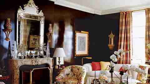
Convinced that dark colors are more glamorous than light, Buatta painted the living room walls one of his favorite colors—eggplant. He then glazed and treated them with acid, the exact nature of which, like a jealous chef, he refuses to divulge. "It creates the feeling of porphyry. Eggplant is a great color on which to display paintings, and at night it reflects the city lights."
Manhattan itself is, in fact, a key part of the design, and the apartment has unobstructed views in every direction, from the sweep of Fifth Avenue to the south, Columbus Circle to the west and the George Washington Bridge far to the north. When Ross and Geary gave their first party, everyone was puzzled by a concentration of bright lights in the distance. Finally one of the guests, a baseball fan, provided an explanation. From their privileged perch they could see all the way to the Bronx, and that mysterious spot of light was Yankee Stadium. Through a careful placement of mirrors—one living room wall is covered with mercury glass—Buatta has brought those astonishing views right into the apartment. Wherever you are, you see, through windows or through reflection, the city around you, ever changing, never boring.
The apartment seems larger than it is—it has only two bedrooms—and Buatta had to use more than a little ingenuity to pack everything in. Ross and Geary like to entertain, but there were no closets or cupboards for crystal and china. Buatta's solution was to place open shelves on one wall of the dining room, then to cover them—and the other walls along with them—with lime-colored draperies. The result is not only one of the most unusual dining rooms in New York but also one of the quietest, a blessing for those who don't like to have to shout to their dinner partners. "You can have 30 people for dinner and still hear a pin drop," says Buatta.
The bedroom—the second bedroom has been turned into a combination office and exercise room—Buatta calls "the Empire State Bedroom." That is a reference both to the Empire State Building, which dominates the view to the south, and to the mirrored bedposts, which rise in steps, wider at the bottom than the top, just like the world's most famous skyscraper. "Hilary loves blue and white," says Buatta, and he has carried those colors right up to the bed canopy, which has a constellation of white stars in a universe of soothing light blue. "It's cozy yet glamorous," says Geary.
One aspect of good design is contrast. Realizing that too much color can be, well, too much color, and as boring as endless walls of beige, Buatta banned all color from the entrance hall. The floors are black-and-white checkerboard, and the walls are covered with silver tea paper. "There was so much color in the apartment that I wanted the foyer to be ethereal," he says. "Silver gives the room an airy feeling. When you step inside, you feel you've gone to heaven." Or someplace very close to it, anyway.
Is Wilbur Ross crazy? The answer is obvious to anyone who walks into that celestial hallway. If he is, everybody should be so nuts.