Tour a Greek Revival Townhouse With Traditional and Midcentury Details
Like doctors, lawyers, and good therapists, an interior designer is an enviable friend to have. When a Manhattan family of five decided to make the daunting jump from their three-bedroom apartment in Manhattan’s trendy Nolita neighborhood to an 1836 Greek Revival townhouse in the West Village, they had a careful steward in Jessica Wilpon Kamel, one half of the New York interior design firm Ronen Lev, who just happened to be the homeowner’s dear friend.
“Envisioning a finished space doesn’t come naturally to me,” the homeowner says, “but with Jessica’s insight even I could feel what was possible. It was really helpful to go through the process with a friend.” Especially when that friend has a seemingly endless contact list of helpful interiors insiders, from AD100 architects to aspirational home decor shops in London. After scouting real estate options with the family prior to the property’s purchase and discussing the necessary scope of work, Kamel’s first suggestion was a no-brainer: Enlist Elizabeth Roberts, the New York–based architect who is perhaps most responsible for jump-starting the Brooklyn brownstone renaissance among the city’s most stylish celebrities and trendsetters.

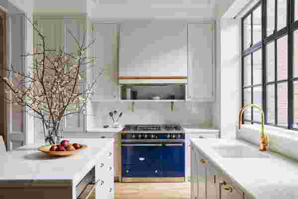
Marble countertops, brass fixtures, subdued zellige tiles, and a Lacanche range underscore the house’s traditional feel in the kitchen, which was designed by Roberts’s team under the supervision of project manager Josh Lekwa. “I love being able to sit at the kitchen counter and look out at the garden,” says the homeowner of the back wall of windows.
The family worked with project manager Josh Lekwa to, in Roberts’s words, “respect and enhance the historical character of the house,” without hampering the design with overly ornate flourishes, all while infusing it with a modern, airy aesthetic that allows the rhythms of contemporary life to reverberate throughout the spaces. “They wanted a warm, unfussy home with beautiful period details—and good water pressure,” says Roberts.
So she and her team embarked on a three-year gut renovation whose scope seemed to balloon with every inspection. “After we began designing but before we started construction, we discovered that the foundations had totally fallen apart, the brick walls were falling apart on every level,” says Roberts. “What was intended as a restoration gradually became more of a reconstruction. We had to shore up and underpin all of the disintegrated foundations, replace every floor joist, rebuild the collapsing chimneys, and replace half of the roof.” In addition to overseeing the tricky installation of an elevator, a new staircase, and an operable skylight in the living room, as well as the interior architecture in the kitchen and bathrooms, Lekwa also spearheaded an ambitious historical research initiative that incorporated original details like carved pilaster capitals rendered in new plaster and reclaimed fumed-oak flooring.

Classic subway tile and a monochromatic white color scheme keep the children’s bathroom looking neat and tidy. The hardware is by E.R. Butler & Co.
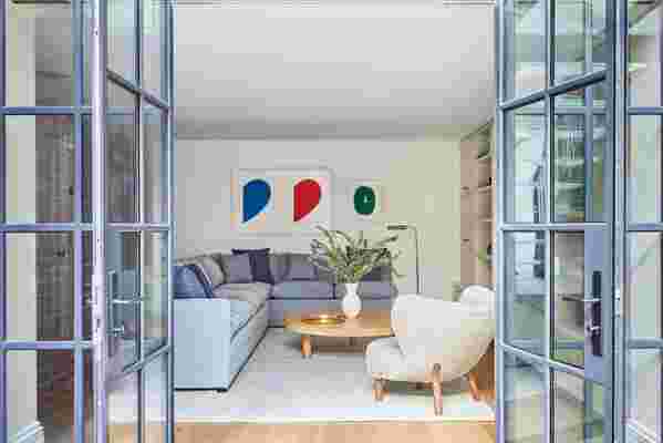
With the new framework in place, Kamel and partner Christina Akiskalou were tasked with finding a middle ground between the husband’s love of midcentury modern sleekness with the wife’s affinity for traditional shapes and textiles. They landed on a transitional look informed by New British whimsy, blending midcentury pieces that didn’t play to type—like the Charlotte Perriand Tabouret stools, Josef Frank sconces, and Jacques Adnet drink trolley in the living room—with classic velvet-upholstered chairs and modern lighting by Apparatus. The soothing color scheme of blues, greens, and grays allows the furnishings, which are clad in durable fabrics and cozy finishes, to fade into the background. “Kids tend to fill spaces with a lot of color themselves, so it gives the family a palette they can maintain and doesn’t feel overwhelming,” says Kamel.
She would know firsthand. The designer spent years thinking through the project with the homeowners, rummaging through their cabinets to get a better sense of how they live in a space. “Because we’re so close, there were a lot of very micro-level decisions being made, and we spent a lot more time than we would typically spend doing site visits and having conversations about dishes and trinkets and everything they would need to support the kind of open-door lifestyle they wanted,” Kamel says, noting the bounty of custom storage and millwork she and Akiskalou incorporated into the design.

Still, the unfettered intimacy did manage to produce a few disagreements. “I would want to style the house every time I came over,” says Kamel, recalling the priceless hand-and-foot brass trinkets the homeowners’ three-year-old would regularly remove from the desk in the library and stash in her bedroom. Adds her client, “Jessica’s style is more on the Scandi-mod side, and there were times when I’d have to push back and say, ‘File that away for your next project.’” In design, as in life, what’s a little honesty among friends?