Tour Lantern House, Thomas Heatherwick’s First U.S. Residential Project
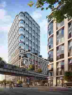
Down under the High Line is a suspended glass canopy that shelters a 1,900-square-foot sculptural lobby for one of New York’s most distinctive new residential buildings. Lantern House is London-based designer Thomas Heatherwick’s first completed housing project in the United States, and its design is shaped by the principal observations of an architecturally-minded city tourist.
Situated on a site that extends beneath and on either side of the 1.5-mile stretch of elevated train tracks turned park, what became seemingly every vacationer’s hangout during non-COVID-19 times, the dual-tower project features bits of culled American architectural history: A gray brick façade references the industrial warehouses of this largely former meatpacking district; the way the aforementioned lobby wraps itself around the High Line’s structural supports alludes to the twin palms that puncture the overhang at architect Albert Frey’s Palm Springs City Hall; its bulging, lantern-like windows are a contemporary interpretation of a brownstone’s bay windows. The latter, however, are also aimed to set the structure apart from its peers.

A rendering of New York’s Lantern House, designed by Thomas Heatherwick with interiors by March and White Design.
“We didn't feel we needed to turn the whole building into a singular gesture,” says Heatherwick; but he notes that he felt “passionate about the people being able to break away from the strip rectangular windows” of a “typical new residential project.” Although Lantern House’s windows are distinct, “emotional feelings are incited by its materials and textures. They leave the biggest impression,” he continues. To create interiors that complemented the designer’s emotive exterior, global firm March and White Design took a “humanistic, experience-centric design approach” that balances “comfort and intentionally designed spaces,” says principal Elliot March. Natural materials like wood and marble feature, as does sculpturally faceted hardware. Unveiled exclusively by AD , the architecturally inspired model apartment, staged by creative consultant Carlos Mota, is a bold and vibrant energy match to its building’s bustling neighborhood.

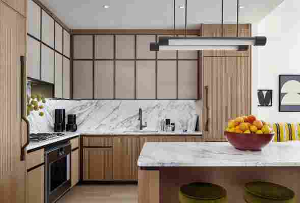
A look at the kitchen, which features a clean, minimalist design.
“Designers often use a lot of neutral colors so that the interiors appeal to as many people as possible, but I didn’t want to do that with this home,” explains Mota, whose enthusiasm for color is evident in his design, a mix of old and new where bold seating silhouettes have been recovered in punchy Pierre Frey fabrics, and ABC Carpet & Home rugs add subtle pattern. “For me, green is the new neutral,” he says in reference to the living room’s standout sofa, also covered in a Pierre Frey fabric. For the room’s reupholstered 1950s armchairs, “I landed on a beautiful mustard yellow that just popped with accents of black. Black complemented the yellow and green hues and softly recalls Lantern House’s brick exterior,” he explains.

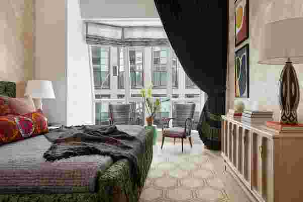
A peek inside the primary bedroom.
Because the custom windows allow greater light and views than their flat rectangular counterparts, both March and Mota chose to leave them largely alone, setting furniture away to allow their special character to shine. Instead, Mota made bold statements on the solid walls, inspired by French modernist Jean-Michel Frank. In the jewel box main bedroom, a boiserie-style wallpaper by Maya Romanoff wraps the space for a cozy feel, while in the living room, the lacquered walls and ceiling reflect ample sunlight. He sourced furniture in Miami, New York, and France, and the vintage pieces are dated between the 1940s and 1960s.
While parts of the model unit have splashes of color, the bathroom is a calming space of monotones.
For every designer involved in the project, livability was key. Stocked with contemporary amenities including a two-story health club, a roof deck, a library, and a garden by Hollander Design, Lantern House aims to “reinvent a New York building,” says Heatherwick, by embracing some of the quirks of its historic residences. “For many decades there has been lovelessness in new building design; it looks great from a distance but up close there is no detail, no personality,” he opines. “Why aren't we making things that connect with humanism? In historic buildings people enjoy these perks.”
On the interiors, the distinctive nature of the windows inherently creates a space that feels more designed than the glass-box homes Heatherwick is referencing. “If anything, the pandemic has led to a kind of renaissance for the design world,” says Mota. “Your home is so important right now, and people are reevaluating what they can do to make it special and enjoyable.”