Tour the Bespoke NYC Co-Op of Two Art-World Maestros
Manhattan-based Richard Rabel founded his interiors and art-advising firm eight years ago, but his passion for design first revealed itself decades prior, when, as a child, he would sketch stools and other furnishings. He took a detour into investment banking after studying engineering in college and then eventually gave into his love of art, joining Christie’s for more than a decade. Thanks to an architect friend who persuaded Rabel to work for him in Brazil, he realized his love for houses, moved back to New York, and took classes at the New York School of Interior Design and Parsons School of Design.
In a full-circle moment, Rabel recently undertook the gut renovation of a Manhattan apartment owned by a friend and former colleague at Christie’s. Alan Wintermute, a specialist in Old Masters paintings at Christie’s, and Colin Bailey, the director of the Morgan Library & Museum, had purchased a one-bedroom apartment adjacent to their studio-size pied-à-terre in Turtle Bay and needed an expert’s touch to combine the two into a full-time residence where they could surround themselves with their large collection of beloved Old Masters works. (The couple had just returned from a stint on the West Coast, where Bailey had been serving as the director of the Fine Arts Museums of San Francisco.) “Art is a personal and private thing,” says Rabel, “so it was a privilege for me to help make their pieces take center stage.”

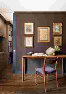
In the library, Benjamin Moore ’s Appalachian Brown “allows the Old Masters drawings to sing,” says Rabel. “Dark colors work well with both Old Masters and contemporary pieces.” A table from Stillfried Wien is paired with a vintage Danish chair and Japanese and Scandinavian ceramics.
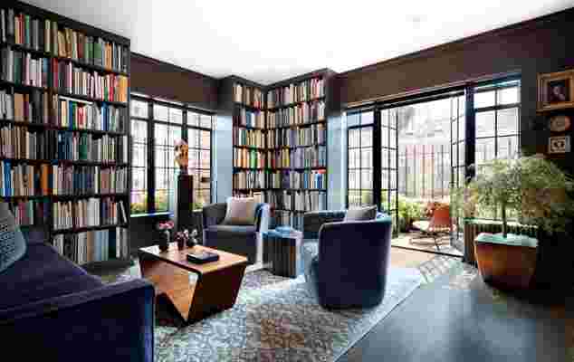
The newly purchased one-bedroom co-op had seen some poor renovations since the building was erected in 1929, so Rabel and his clients decided the best course of action was to gut the 1,500-square-foot space and start anew with a blank slate. The former studio would become the master bedroom; the one-bedroom would serve as the new public areas—including an open kitchen and living area, a library, and an office for Bailey where a closet previously stood. Just about the only element that remained was the original windows, which the designer had manually restored instead of replacing them. “They add a certain charm,” notes Rabel. “The home has been given some Botox, a tan, and a new hair color, but I like that it maintains its 1930s bones.”
Since the apartment was previously a drab 1970s box, he added detail to the architectural envelope in the form of base and crown moldings whose straight lines make it more modern than traditional moldings. “I wanted to create a smart, unfussy, and masculine residence that would embody contemporary living and embrace the couple’s superb fine art collection and library,” says Rabel—a challenge, given how many art books and framed works required display space. Luckily, the designer was able to raise the ceiling height from seven feet to nine feet throughout, making plenty of room for the likes of Jean-Antoine Watteau, Pierre-Auguste Renoir, Lucian Freud, and David Hockney, while “preventing the space from feeling claustrophobic,” says Rabel. To balance out the floor-to-ceiling cerused-oak shelving in the library, Rabel designed low-profile storage that runs the length of the living room. “We didn’t want the home to feel like a bookshop,” notes Rabel. Deep shades of gray, aubergine, brown, and blue “allow the art to sing,” he continues. “People often think white walls are the best backdrop, but they can actually cause artwork to recede into the walls instead of pop.”


The ultimate resource for design industry professionals, brought to you by the editors of Architectural Digest
When it came to the furnishings—a mix of custom and vintage pieces paired with Japanese and Danish ceramics that boast modern forms—most items were tailored to better fit the space. “The home isn’t huge, so it’s important that everything has the right proportion,” says the designer, conceding that he had to rely on a little help from Wintermute in convincing Bailey, who typically favors more traditional decor, to go outside his comfort zone. “The finished aesthetic is one that wouldn’t have naturally come to any of us, which means that it’s a true marriage of client and designer. And those are always the best projects.”